Cebu City's coffee scene has never been more competitive. From Ayala Center to IT Park and Lahug, specialty cafés are opening every quarter — and the ones that last are not just the ones with the best beans. They are the ones with the strongest brands. Peak Coffee Roasters came to us with a clear brief: build an identity that matches the obsession and precision behind specialty coffee. No compromises. No generic café aesthetic. A brand built to command the room — and the shelf, the cup, the menu, and the feed.
The Challenge: Standing Out in Cebu's Saturated Coffee Market
IT Park in Cebu City is one of the most caffeine-dense square kilometers in the Philippines. Dozens of cafés compete for the same BPO workers, tech professionals, and weekend crowd. Most of them look the same — the same neutral palettes, the same minimalist sans-serif, the same "artisan" aesthetic that stopped feeling artisan years ago. Peak Coffee Roasters needed to be unmistakably different. The brand had to communicate precision and craft — not just on a menu, but across every single touchpoint.
The Strategy: Minimal System, Maximum Presence
We built the PCR identity around a geometric symbol — a mark constructed from the brand's initials P, C, and R, forming a path going upward. Clean, precise, and immediately legible at any size. The primary palette is Black, Grey, and White — a deliberate decision that forces everything to live or die on form and composition, not color. Secondary tones of Mahogany, Sky Blue, and Bean provide warmth and specificity when needed. Outfit was chosen as the sole typeface — ExtraBold for display, Regular for labels — because its geometric precision works at every scale, from a 2mm stamp to a 2-meter backdrop.
“Great café branding does not look like café branding. It looks like a brand that happens to be a café — with a point of view, a voice, and a visual language strong enough to carry the entire business.”
The Deliverables: 50+ Assets Across Every Touchpoint
What we delivered for Peak Coffee Roasters:
- Full logo suite — PCR combination mark, horizontal, stacked, and icon versions across all colorways
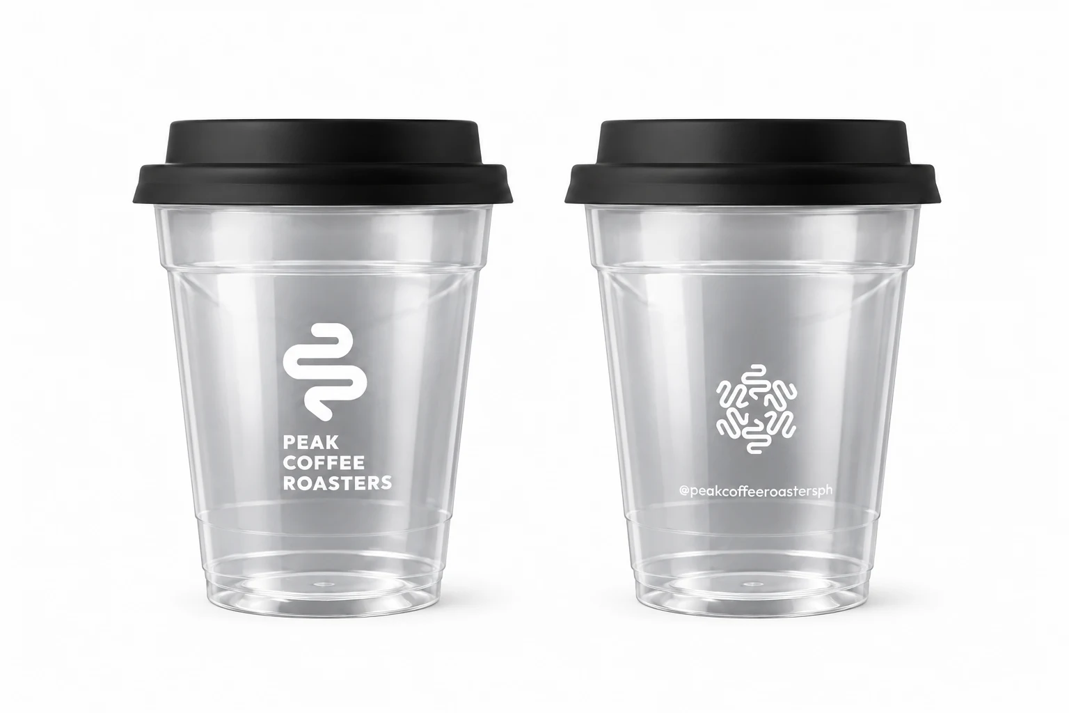
- Branded cups — hot and cold cup designs that carry the identity into every hand that holds one
- Bean bag packaging — premium kraft packaging with full bleed brand application
- Paper bags and tissue — the entire take-out experience, branded end to end
- Café menu — typography-forward design that sells the philosophy before the product
- Tasting cards — detailed per-origin cards that position the café as a craft destination, not a commodity
- Sticker suite — collectible, giftable, and impossible not to put on everything
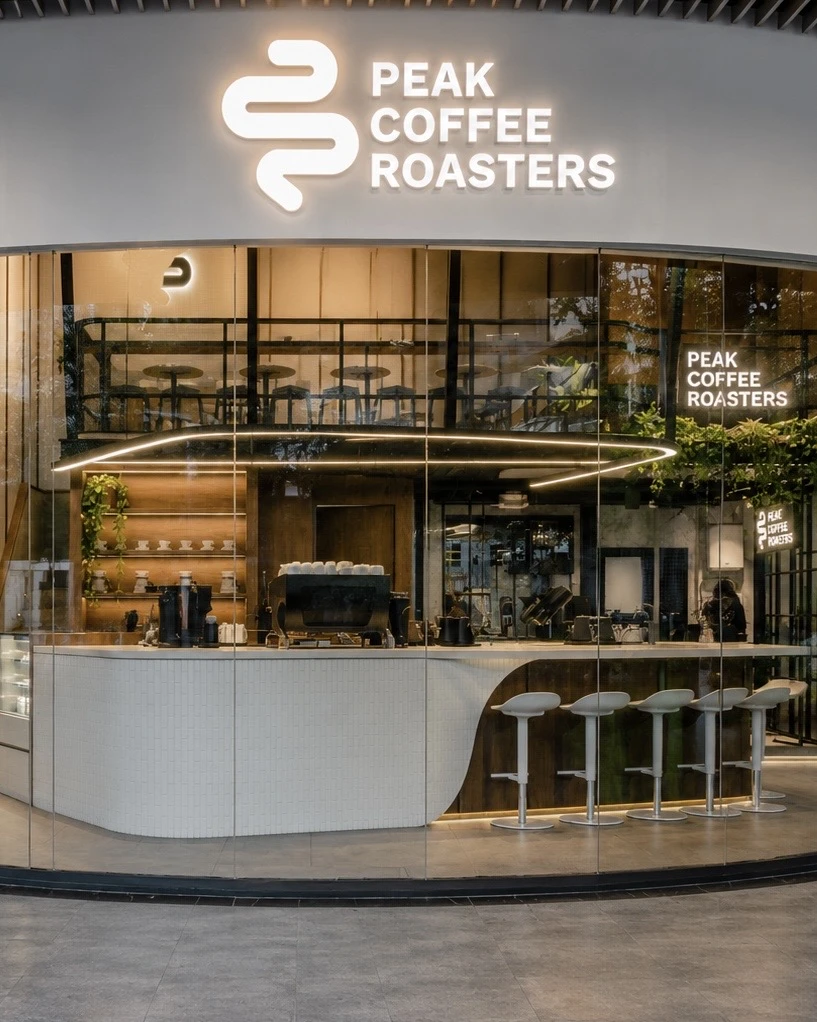
- Laser-cut wood signage — the physical brand presence that makes the space unmistakable
- Digital menu display — HD-formatted content for in-café screens
- Company ID cards — the internal brand that signals to staff this is a serious operation
- Full social media template suite — Instagram and Facebook templates for launches, promotions, and education content
Why Specialty Cafés in Cebu Need More Than a Logo
The coffee shop owners who succeed long-term in Cebu — in IT Park, in Capitol, in the growing café strip along Escario — all share one thing: they treat their brand as seriously as they treat their beans. Your brand is the first thing a new customer sees before they taste a single sip. It is the reason someone chooses to photograph their drink and tag you. It is the reason a first-time customer becomes a regular. Peak Coffee Roasters understood this from day one. The investment in a complete brand system was not just about aesthetics — it was about building the infrastructure for a business that lasts.
The Result: A Brand That Competes at the Highest Level
Peak Coffee Roasters launched with a brand identity that looked like it came from a studio in Tokyo or Melbourne — because the brief demanded nothing less. The complete system carries consistently from the first Instagram impression to the cup in the customer's hand, from the laser-cut sign on the wall to the tasting card on the table. Every touchpoint reinforces the same message: this is a café that cares about every detail. See the full Peak Coffee Roasters case study for the complete visual system.
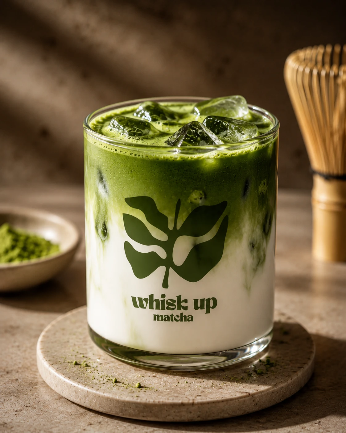
Coffee and matcha brands face the same problem from opposite ends — see how we approached it for Whisk Up Matcha and Uji-Matcha Café. More of our identity work is in the branding portfolio.
Designing for an IT Park crowd
Cebu IT Park is a specific commercial environment — dense, competitive, and populated by people making a fast decision on the way to or from work. A brand there is not competing on craft credentials alone; it is competing for recognition at a glance, often from across a lobby or in a queue.
That pushes the identity toward clarity over intricacy. Marks that reward close inspection are wasted when the average viewing distance is ten metres and the average viewing time is under two seconds.
Packaging is the advertising
Specialty coffee has an unusual advantage: customers carry the branding out of the shop and photograph it. Cups, bean bags and paper bags do more distribution work than any paid campaign a local roaster could afford, which makes them the highest-leverage surfaces in the system.
So the suite was built outward from those objects rather than from a letterhead. The same principle applied to Whisk Up Matcha — in food and beverage, the packaging is not an application of the brand, it is where the brand actually lives.
Topics
Explore Huna Creatives