
Uji-Matcha Café started in Baguio in January 2024, in front of Saint Louis University, and built a genuine local following before adding a kiosk at SM City Baguio. It has since opened in Makati, at Legazpi Village — three branches, and a brand that now has to work for people who have never been to the original.
That shift is exactly the moment a logo gets tested. A mark can be slightly imperfect for years while your customers know you by your storefront. The moment you open in a city where nobody does, it has to carry the introduction by itself.
Refining without erasing
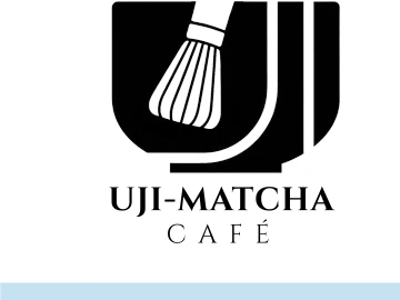
The brand already existed and had an audience — that was the constraint, not the problem. The existing logo had scalability issues: detailed line work that broke down at small sizes, inconsistent stroke weight, a slight visual imbalance. The brief was to fix those without discarding the chasen (matcha whisk) and bowl character its regulars already recognised.
“When a brand already has an audience, recognition is an asset on the balance sheet. Refinement protects it. A rebrand spends it.”
Three directions, one clear answer
We presented three evolution paths:
- Direction A — Refined Evolution: keep the whisk-in-bowl illustration, improve proportions, balance and stroke consistency for scalability
- Direction B — New Brand Expression: an abstract "UJI" lettermark with the chasen integrated into the letterforms, bold and modern
- Direction C — Unified Expression: the "U" merged with the whisk, the most conceptually unified of the three
- Typography: Cinzel for display, echoing classical structure and Japanese craft heritage, paired with Gilroy for body copy
- Colours: Forest Green, Charcoal, Amber and Sky Blue — bridging Japanese heritage and contemporary café aesthetics
What expansion demands of a mark
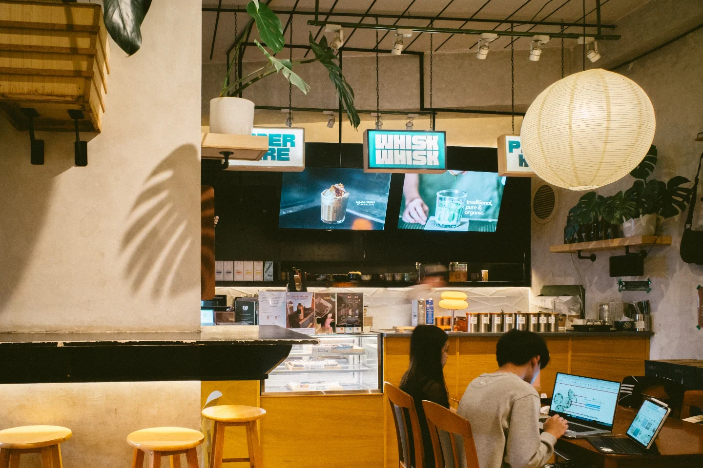
A single-location café can lean on its space to do the branding. A multi-branch one cannot. The mark has to survive a mall directory, a delivery app thumbnail, a paper cup and a shopfront sign — often at sizes where fine line work simply disappears. Most of the refinement work was about exactly that: making the mark legible at 16 pixels without losing what makes it specific at full size.
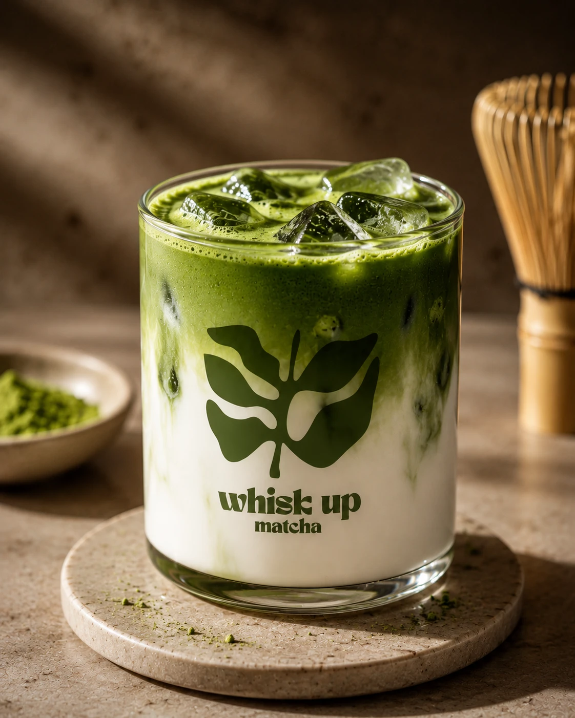
It is the same discipline behind the identity systems we build from scratch, just applied in reverse — preserving equity instead of creating it. The contrast is clearest against Whisk Up Matcha, a matcha brand we built with no existing equity at all, in the same period.
The portfolio
The complete refinement study is in our portfolio: Uji-Matcha Café logo refinement. If you are running a café or beverage brand that has outgrown its original identity, that is the work to look at — or see the full range of what we do.
Refinement is harder than a rebrand
A rebrand is, counterintuitively, the easier commission. You start from strategy, you are unconstrained, and anything you produce is new by definition. A refinement gives you a fixed silhouette you may not abandon, an audience who will notice any change, and a client who cannot articulate which parts are load-bearing — because to them it is simply the logo.
So the first job is diagnostic, not creative. Which elements are carrying recognition, and which are just artefacts of how the original was drawn? For Uji-Matcha Café the chasen and bowl were doing the recognising. The specific stroke weights, the exact tine count, the slight optical lean — none of that was load-bearing. That is the material you are free to fix.
What actually breaks at small sizes
Detailed line work fails in a predictable order. First the thinnest strokes fill in when printed on absorbent stock. Then adjacent lines merge into a single mass. Then the whole mark stops reading as an object and becomes a smudge with a recognisable outline. On a delivery app thumbnail or an embroidered polo, this happens well before the logo looks small to a designer on a large screen.
The fix is unglamorous: equalise stroke weights, open the counters, increase the spacing between tines, and correct the optical balance so the mark sits square when set beside type. None of it is visible as a change to a regular customer. All of it is the difference between a mark that survives a mall directory and one that does not.
Three directions is a conversation, not a menu
Presenting three routes is not about offering choice for its own sake. It is the fastest way to find out what a client is actually willing to give up. Direction A tested whether they wanted continuity. Direction B tested whether they were open to leaving the illustration behind entirely. Direction C tested whether a hybrid could hold.
The answer to that question tells you more than any brief. A brand that has just committed to a second city usually discovers, when shown the alternative, exactly how much of its existing recognition it is unwilling to spend — and that is the real decision underneath the logo.
Type and colour carry the expansion
Cinzel for display gives the brand classical structure — it echoes the craft heritage matcha carries without resorting to pastiche Japanese lettering, which ages badly and travels worse. Gilroy handles body copy, menus and signage, where legibility beats character every time.
The palette does similar work. Forest Green and Charcoal anchor it, while Amber and Sky Blue keep it from reading as another earnest wellness brand. For a café opening in Legazpi Village — a business district, not a university strip — that lift matters. The same brand now has to work for a Baguio student and a Makati office worker on a Tuesday afternoon.
Topics
Explore Huna Creatives