Uji-Matcha Café
A logo refinement and brand evolution study for a Japanese matcha café — refining the original chasen mark, exploring three distinct directions, and delivering a complete identity system with color, typography, and a full suite of logo variations.
Refining a mark without losing its soul
Uji-Matcha Café had an existing logo with strong character — a chasen (matcha whisk) in a bowl — but it lacked scalability and visual consistency. The challenge was to refine the mark for modern use while honoring the ritual and heritage behind matcha culture. The new identity needed to work across every touchpoint, from cups to signage to digital, without losing what made the original feel authentic.
Three directions, one clear answer
We presented three evolution paths: a refined version of the original illustration, a bold new abstract lettermark integrating the UJI initials with the chasen form, and a unified expression that merged the U letterform with the whisk. Paired with Cinzel for display and Gilroy for body copy, the identity balances Japanese heritage with a clean, modern aesthetic. The final palette — forest green, charcoal, amber, and sky blue — draws from the natural world of matcha.

Logo & Mark

Type System
Cinzel brings classical structure to the display type — its Roman proportions echo the timeless quality of Japanese craft. Gilroy handles body copy with a clean, modern voice. Together they bridge heritage and contemporary without friction.
Brand Colors
Brand in Action

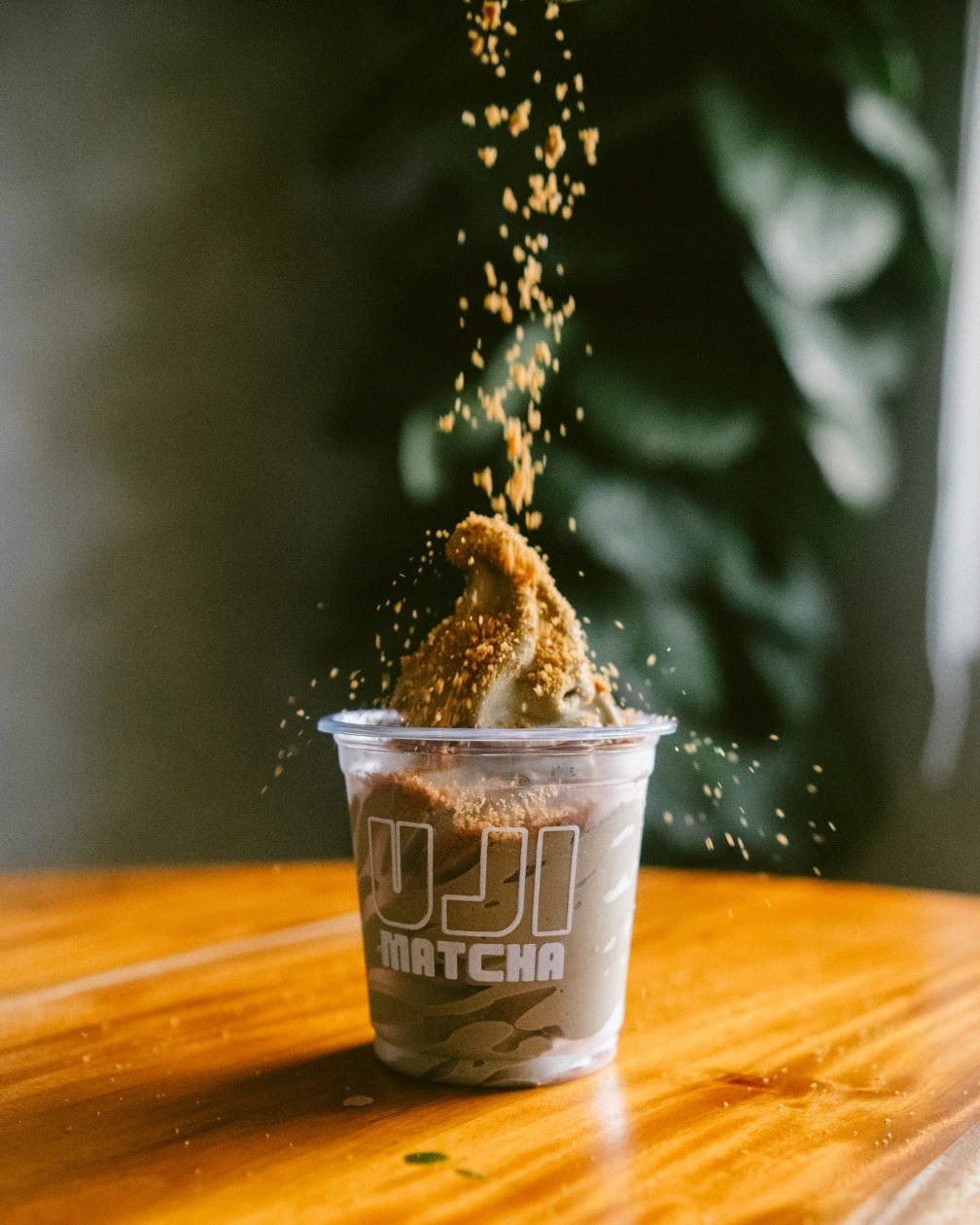


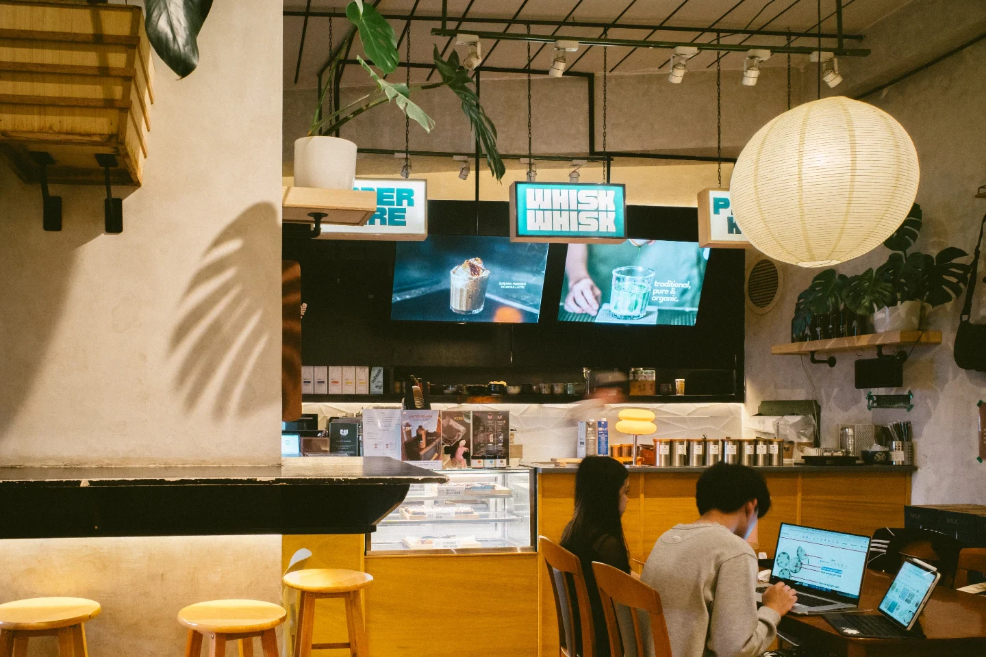



The Impact
Uji-Matcha Café received a refined, scalable identity rooted in their heritage — with a complete logo suite, color system, and typography that carries consistently across every touchpoint.
Want something like this?
Let's build a brand that tells your story.
Get in touch and let's start creating.
Start a Project