Matcha has gone from niche wellness trend to mainstream café staple across the Philippines, and the number of matcha-focused brands has grown with it. Whisk Up Matcha arrived with no existing brand equity and one hard problem: every competitor in the category reaches for the same visual shorthand. A green leaf, a bamboo whisk, a serif in sage.
Building an identity from the ground up
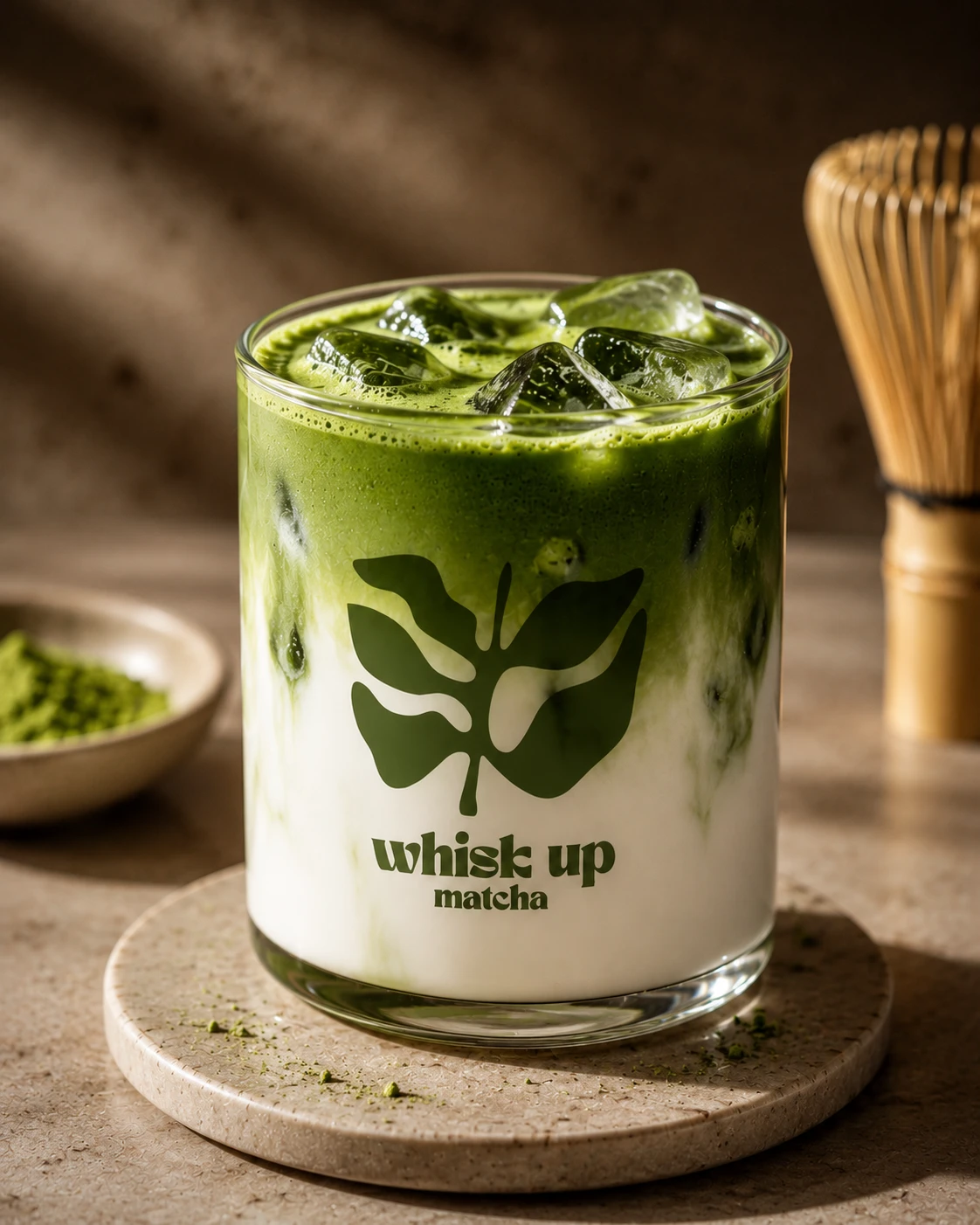
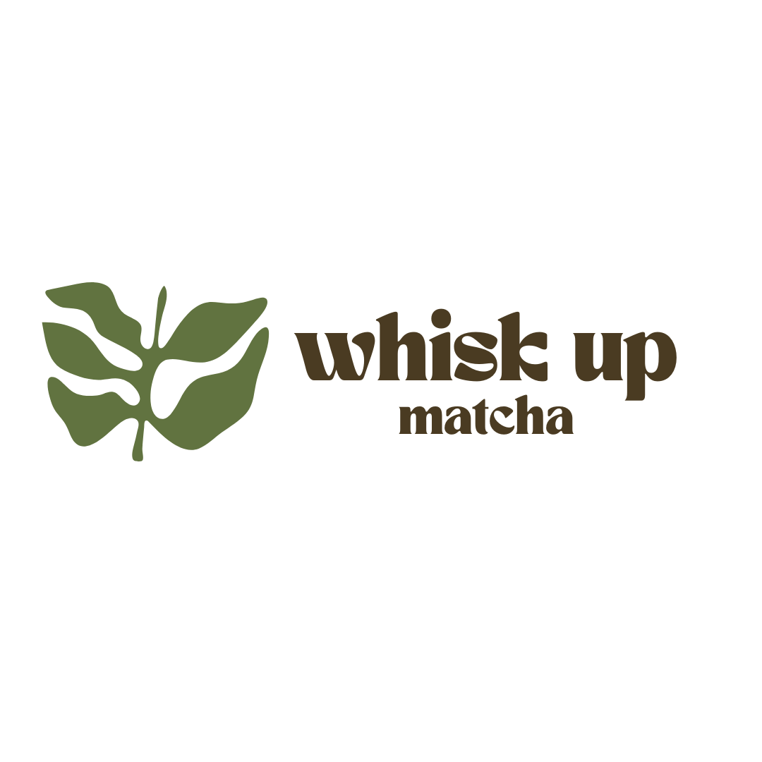
Whisk Up Matcha needed everything — brand strategy, logo, colour system, a full logo suite, and the visual language to carry it forward. The brief called for warm and grounded: not the clinical minimalism of health-food brands, not the generic green-leaf aesthetic of every matcha competitor, but something rooted in the living world the plant comes from. We built the identity around a monstera leaf silhouette — botanical, distinctive, and connected to that world without being literal about the tea itself.
“The best food and beverage brands do not just make you want to buy the product. They make you want to be the kind of person who drinks it.”
A colour story drawn from the landscape
The palette came entirely from the landscape of matcha: Forest Green for the tea itself, Olive for the dried leaf, Amber for the terracotta of the teaware, Dark Brown for soil, and a warm Cream tying it together. The result reads earthy and elegant at once — the visual equivalent of a café that takes its ingredients as seriously as its interiors.
The full logo suite — horizontal lockup, stacked variation, mark only — was drawn to hold up at every scale, from a 16mm cup stamp to a billboard. That range matters more in food and beverage than almost any other category, because the mark spends most of its life very small and slightly wet.
Why matcha branding is its own problem
Matcha sits at an awkward intersection — healthy but indulgent, traditional but photogenic, Japanese in origin but global in appeal. An identity in this category has to hold both sides: honour the ritual without becoming a museum piece, and speak to an audience who found matcha through social media without becoming disposable.
We worked on a second matcha brand in the same period with the opposite brief — an established café that needed evolution rather than invention. That story is in the Uji-Matcha Café refinement, and the contrast between the two is the clearest illustration we have of how differently the same category can be approached.
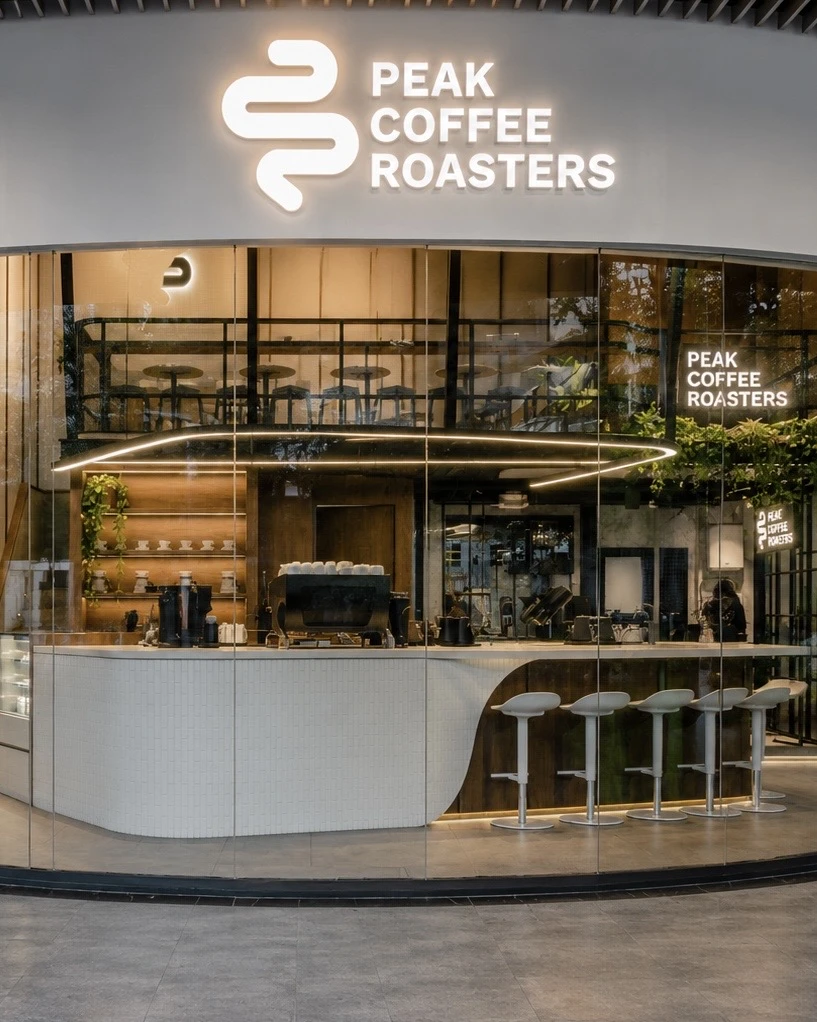
The complete work is in our portfolio: Whisk Up Matcha brand identity. For more café work, see Peak Coffee Roasters or the full range of what we do.
Why not just draw a tea leaf
The obvious mark for a matcha brand is a leaf, and that is exactly the argument against it. Walk through any mall in Cebu or Manila and count the green leaves above beverage counters — the symbol is so saturated it has stopped carrying meaning. It says "this is healthy" and nothing else, which is not an identity, it is a category label.
The monstera works because it is adjacent rather than literal. It reads botanical and alive, it is instantly recognisable in silhouette, and it is not what the shop next door is using. It also survives the hardest test in food and beverage: reduced to a single colour at the size of a stamp, it is still unmistakably itself.
Designing for a cup, not a screen
Most brand presentations show the mark large, centred, on white. Almost none of a café brand’s real life looks like that. It lives on a cup sleeve at 16 millimetres, on a sticker sealing a paper bag, on a sign read from across a food hall, and increasingly in a delivery app thumbnail beside forty competitors.
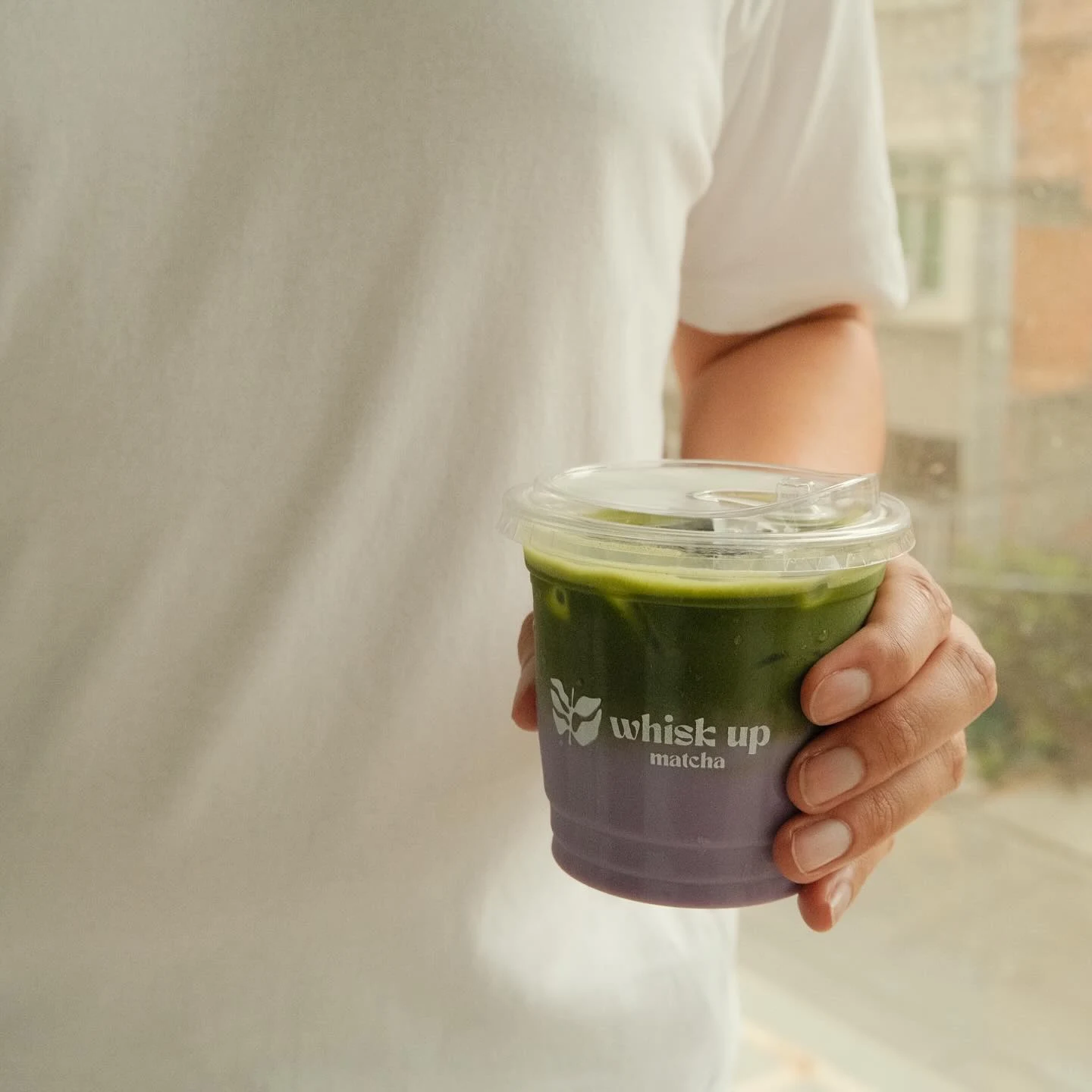
That is why the suite includes a horizontal lockup, a stacked variation and a mark-only version rather than one logo and a set of rules. Each exists for a specific physical situation, so the person printing a sticker at 10pm does not have to improvise.
What the palette has to do
A five-colour palette drawn from nature sounds like a mood board exercise until you try to run a café with it. Forest Green and Olive carry the product. Amber and Dark Brown do the work most matcha brands forget — they warm the brand up, so it reads as a place you sit rather than a supplement you buy. Cream holds everything together and, practically, is what most printed material is actually made of.
The tension we were solving is specific to this category. Matcha is a wellness product with an indulgent price point, sold as a treat but justified as a health choice. A palette that leans fully clinical loses the pleasure. One that leans fully indulgent loses the reason people pay the premium. Holding both is the whole job.
Topics
Explore Huna Creatives