Whisk Up Matcha
A full brand identity for a matcha café rooted in warmth and nature — leaf mark, logotype, color palette, and a complete logo suite built to carry across every touchpoint from cups to social.
A brand as warm as the drink itself
Whisk Up Matcha needed an identity that felt both grounded and inviting — something that communicated the ritual of matcha without feeling overly minimal or clinical. The brand had to appeal to a health-conscious, aesthetically-driven audience while staying approachable enough for everyday visits.
Organic mark, earthy palette
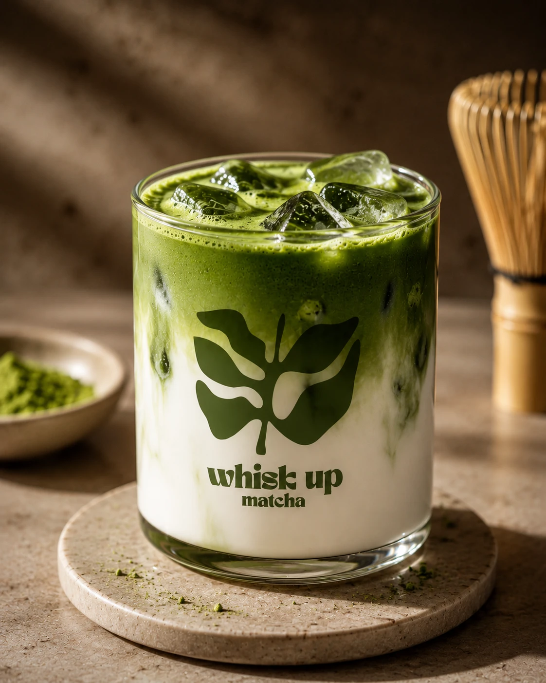
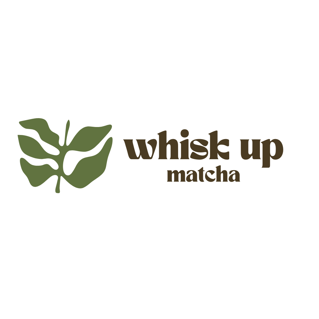
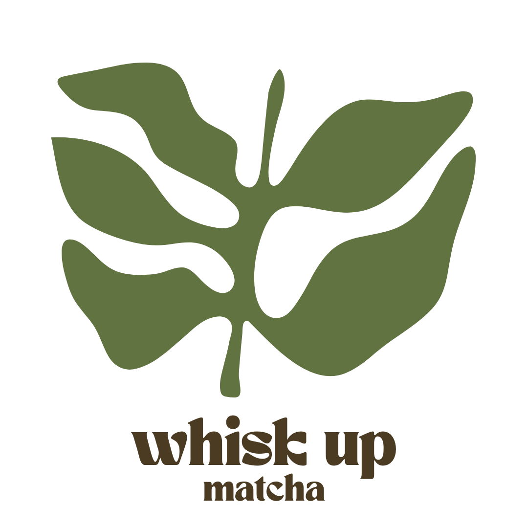
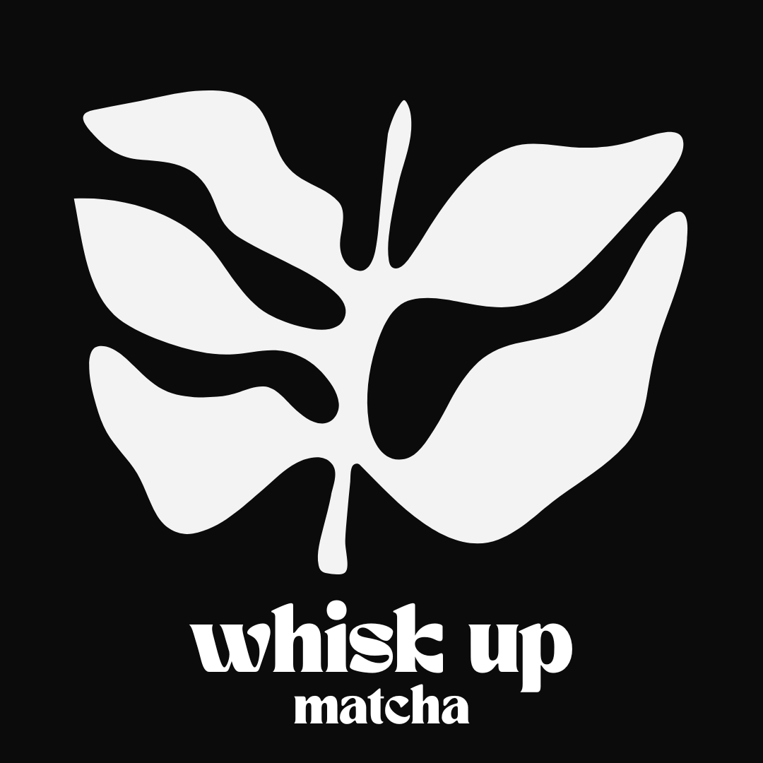
We built the identity around a monstera leaf silhouette — organic, recognizable, and instantly connected to the botanical world of matcha. Paired with a bold rounded logotype, the mark works both as a full lockup and a standalone icon. The palette draws from nature: forest green, olive, amber, and dark brown, anchored by a warm cream base.
Logo & Mark
Type System
A single bold rounded serif carries the entire brand — expressive enough to feel handcrafted, structured enough to stay legible at any size. The typeface reinforces the brand's warmth without sacrificing clarity.
Brand Colors
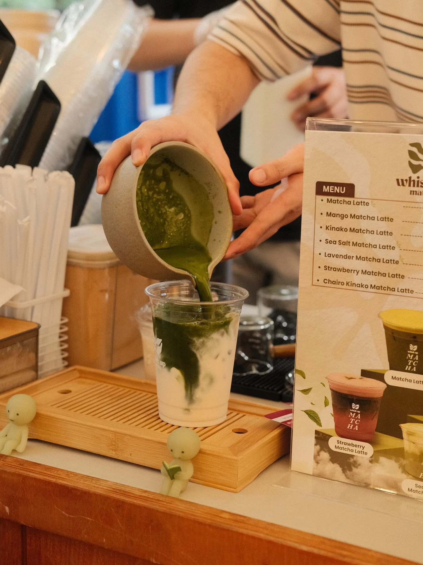
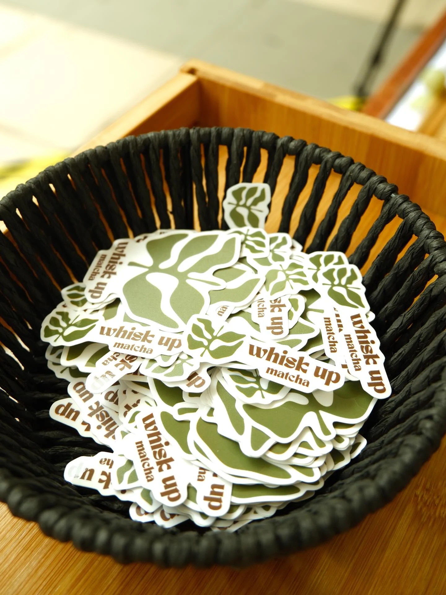
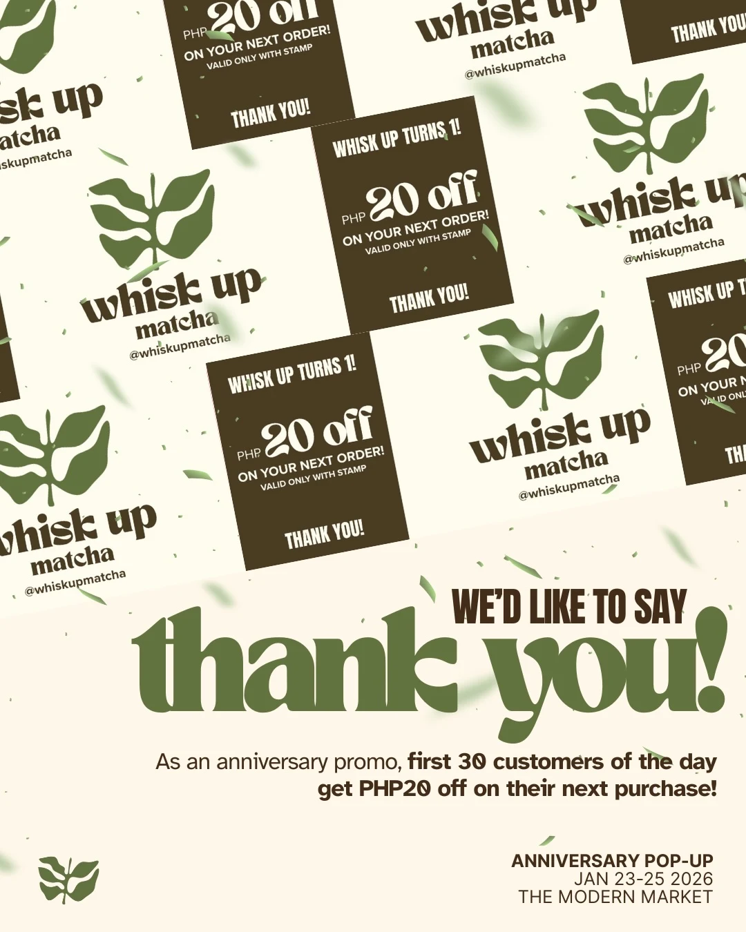
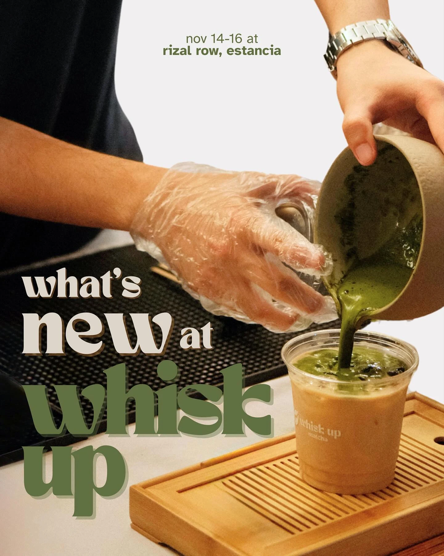
Brand in Action
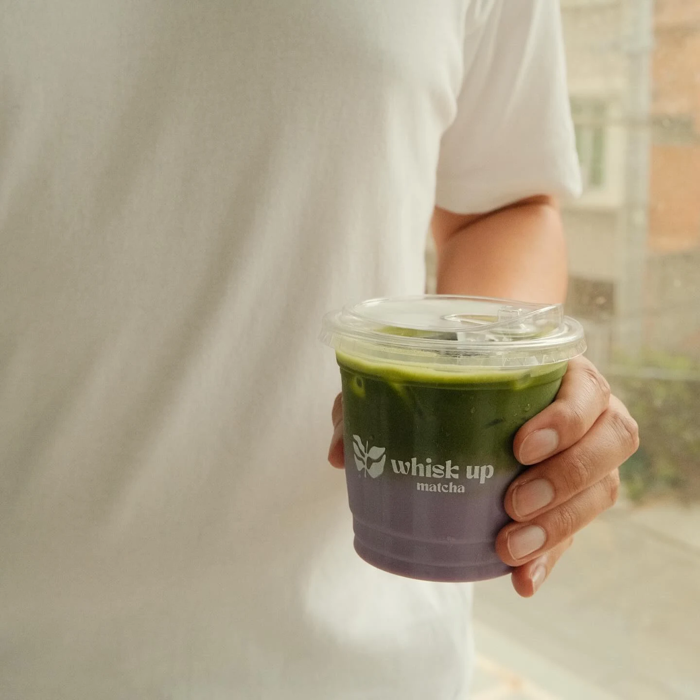
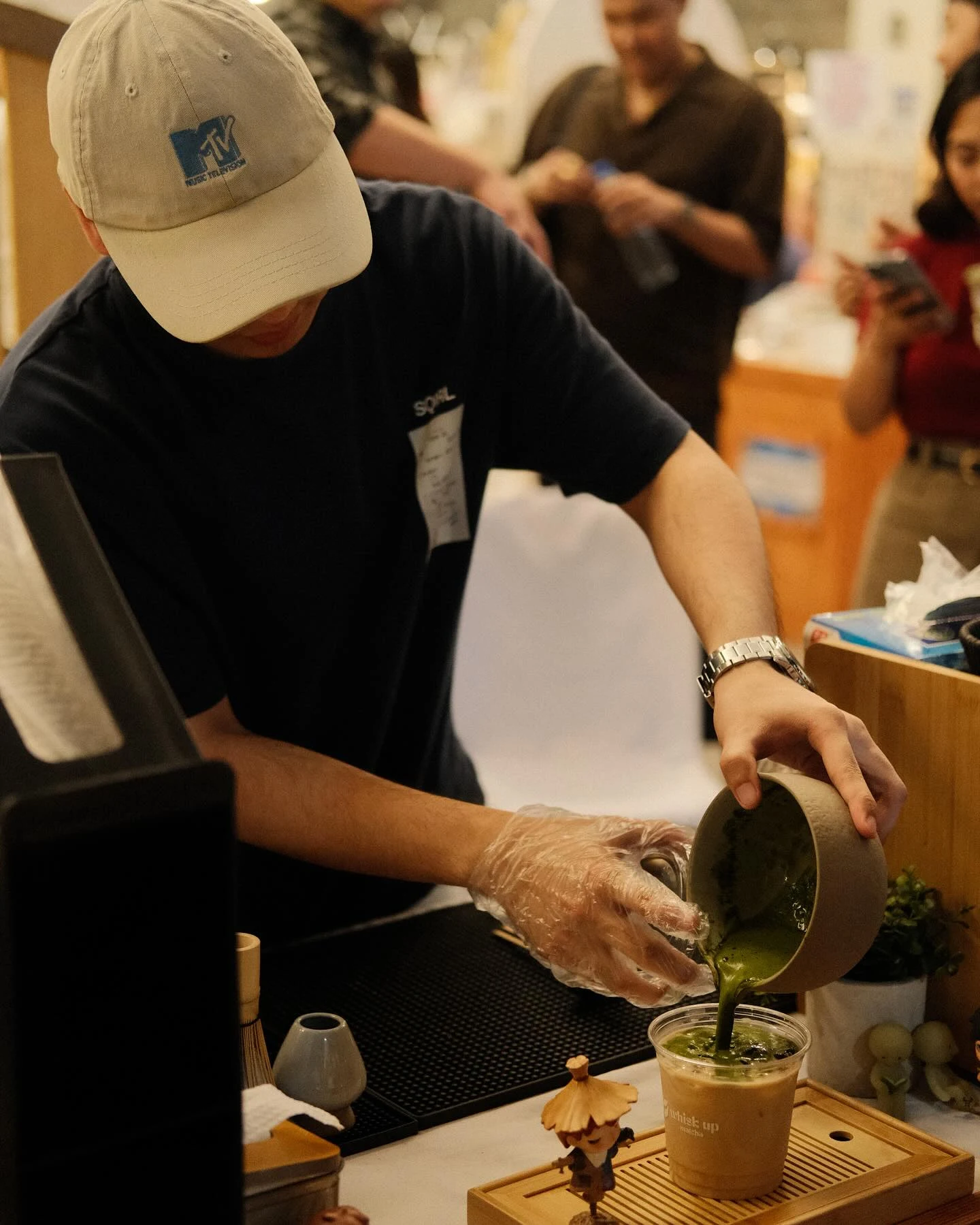
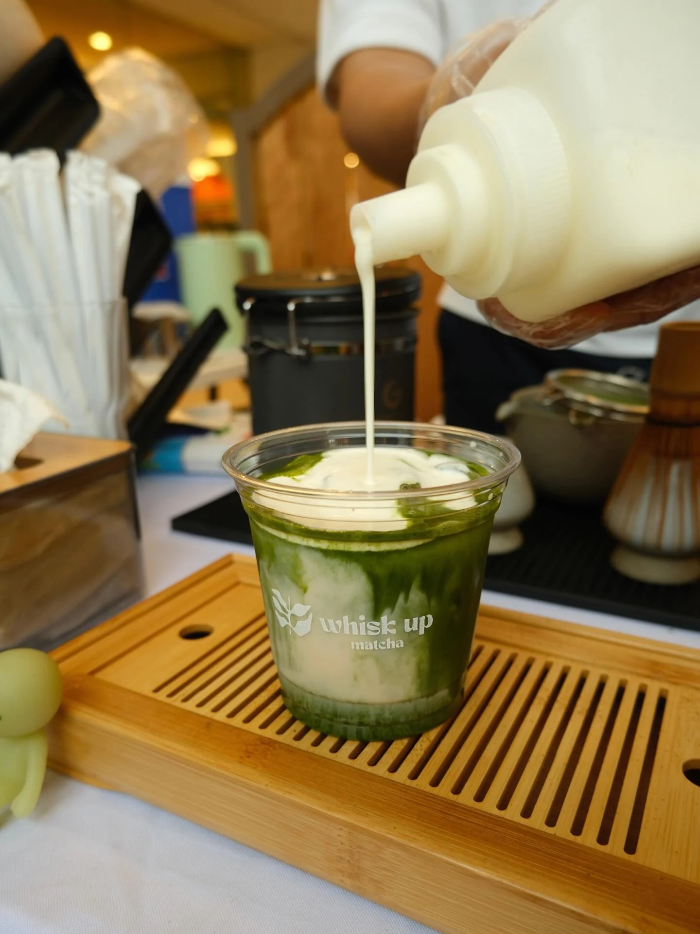
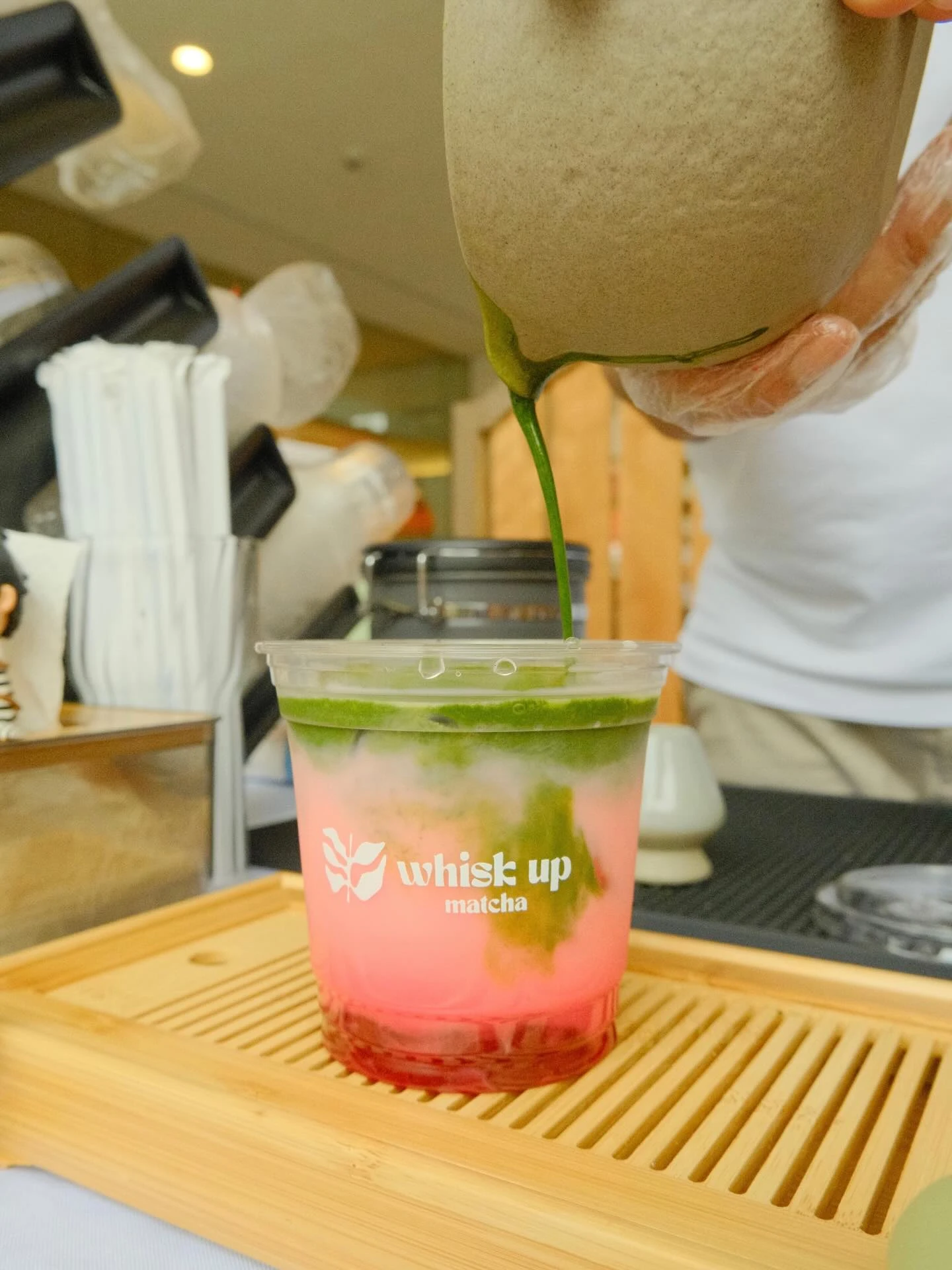

The Impact
Whisk Up Matcha launched with a cohesive identity that felt immediately distinct — warm, natural, and built to scale across physical and digital touchpoints.
Want something like this?
Let's build a brand that tells your story.
Get in touch and let's start creating.
Start a Project