Peak Coffee Roasters
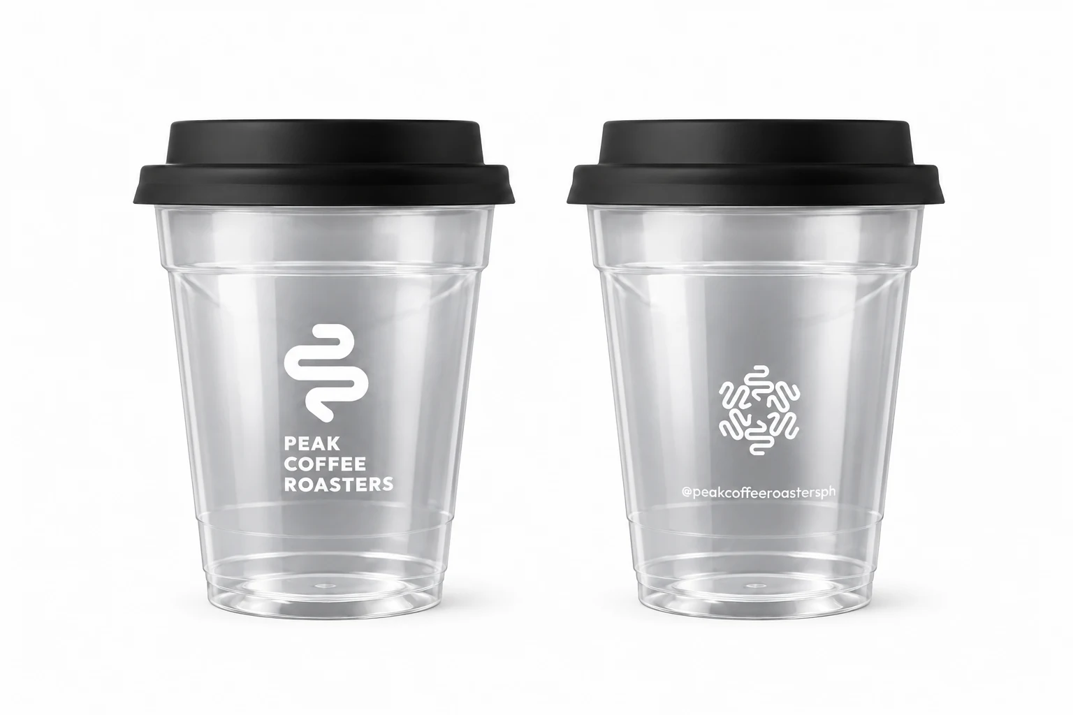
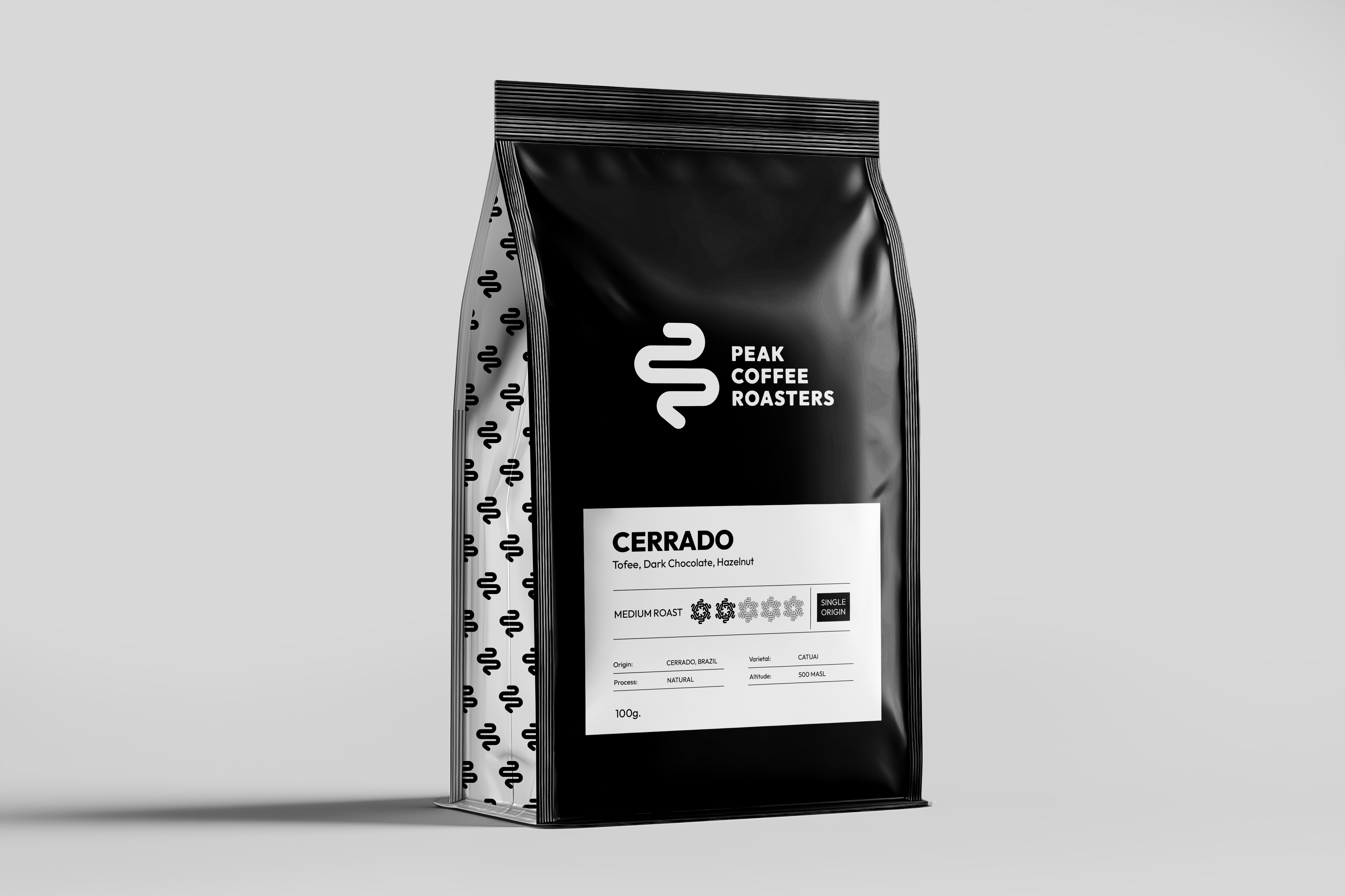
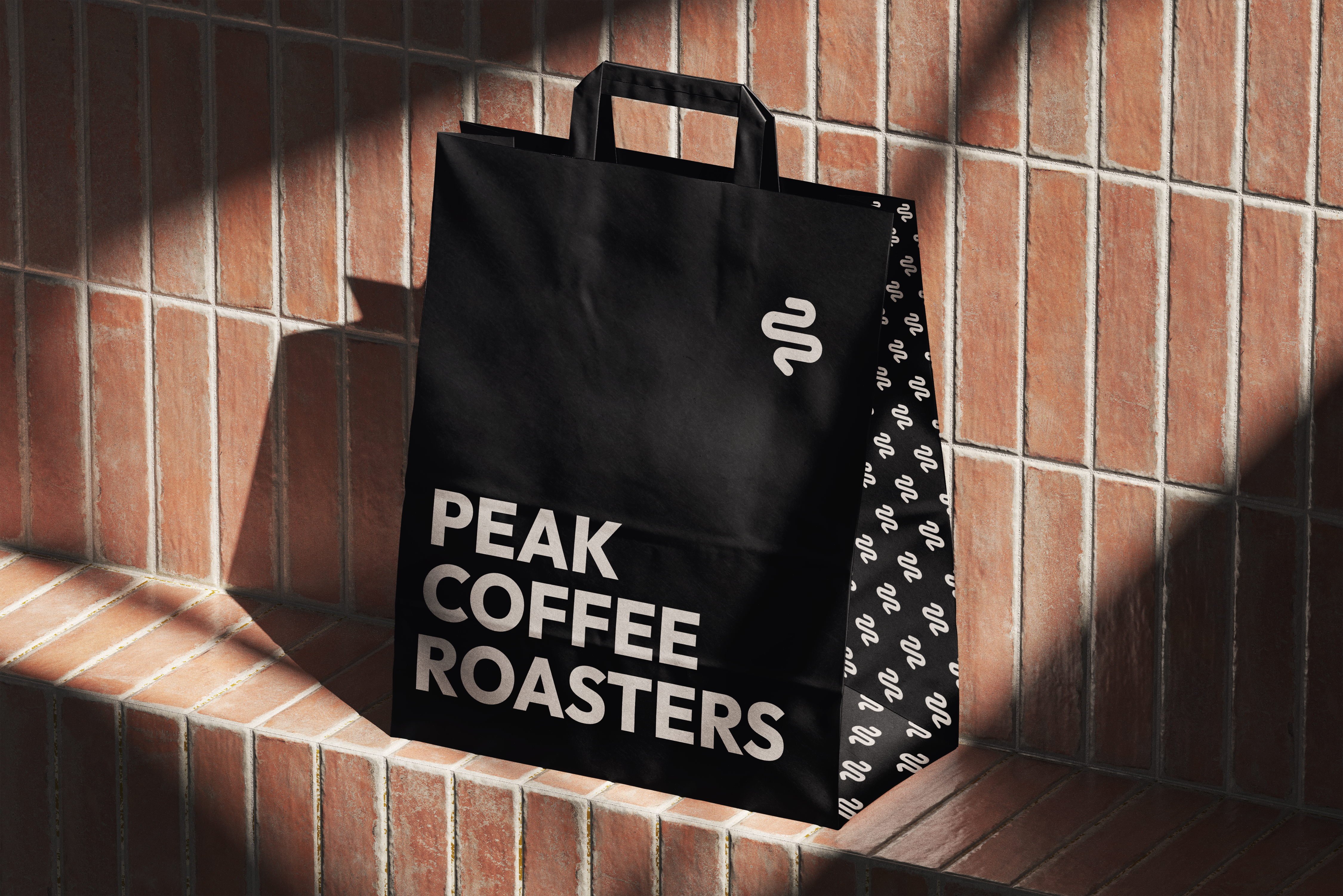
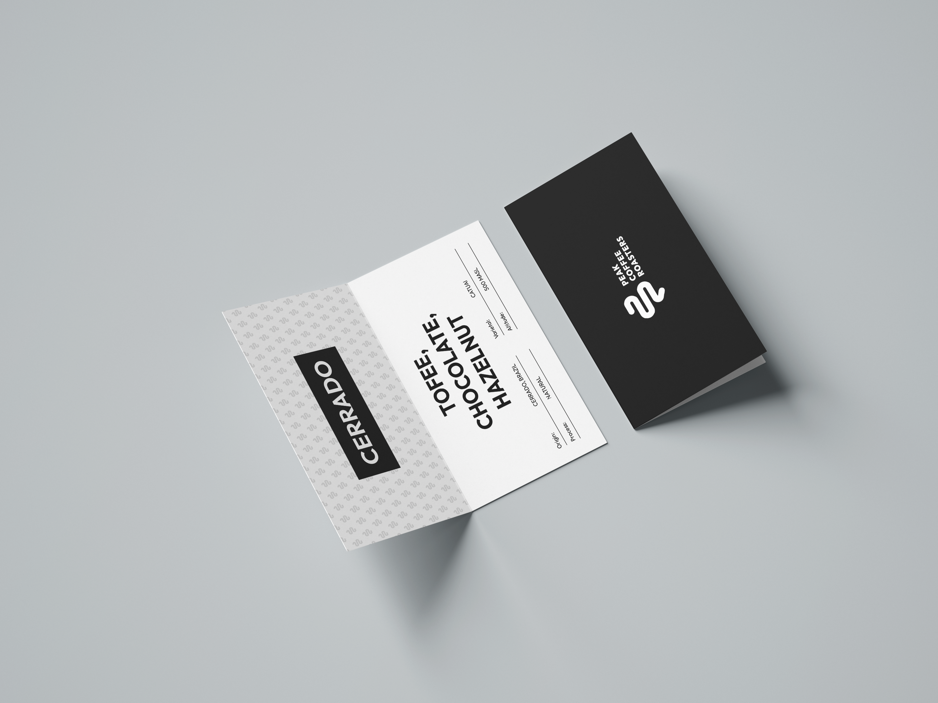
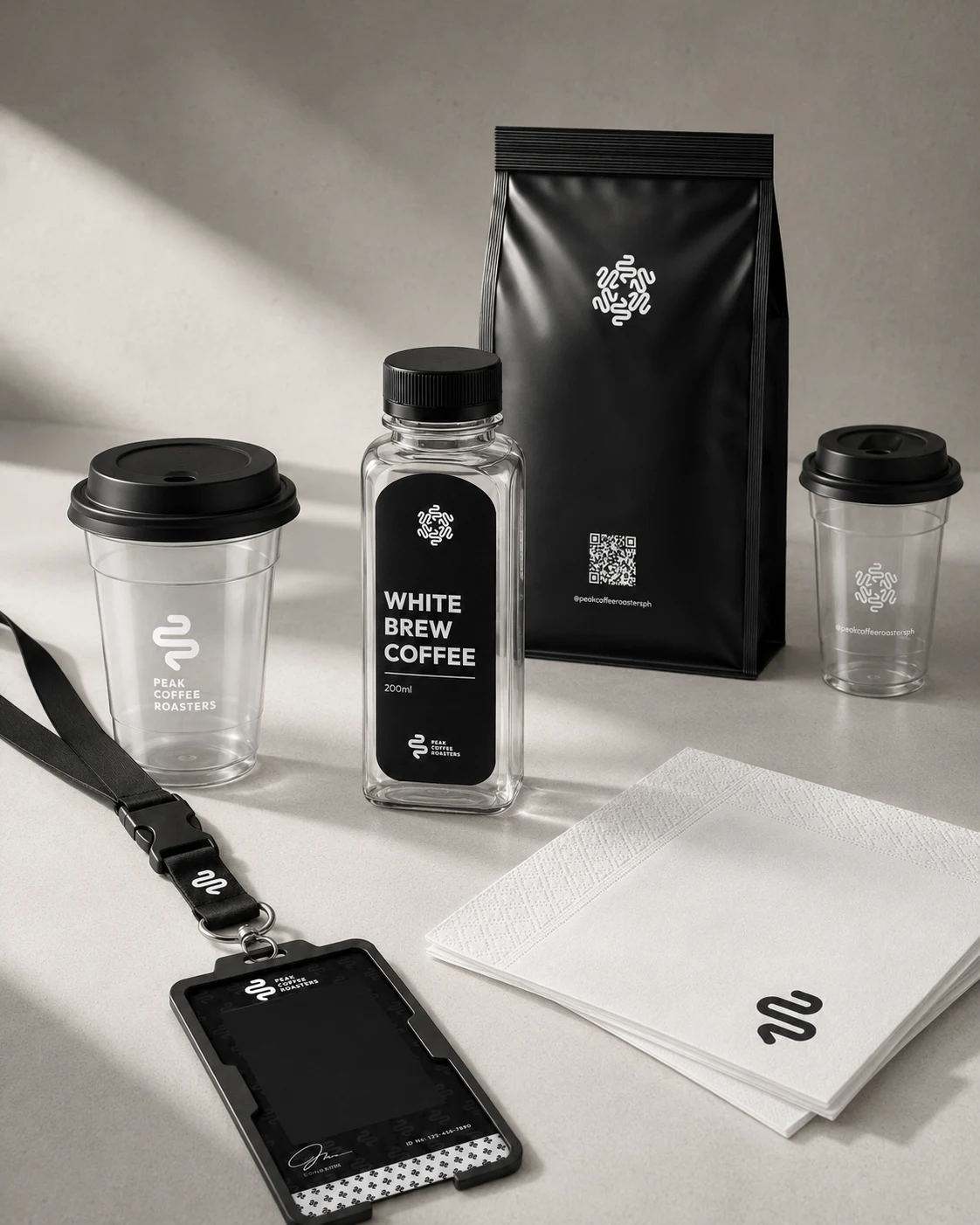
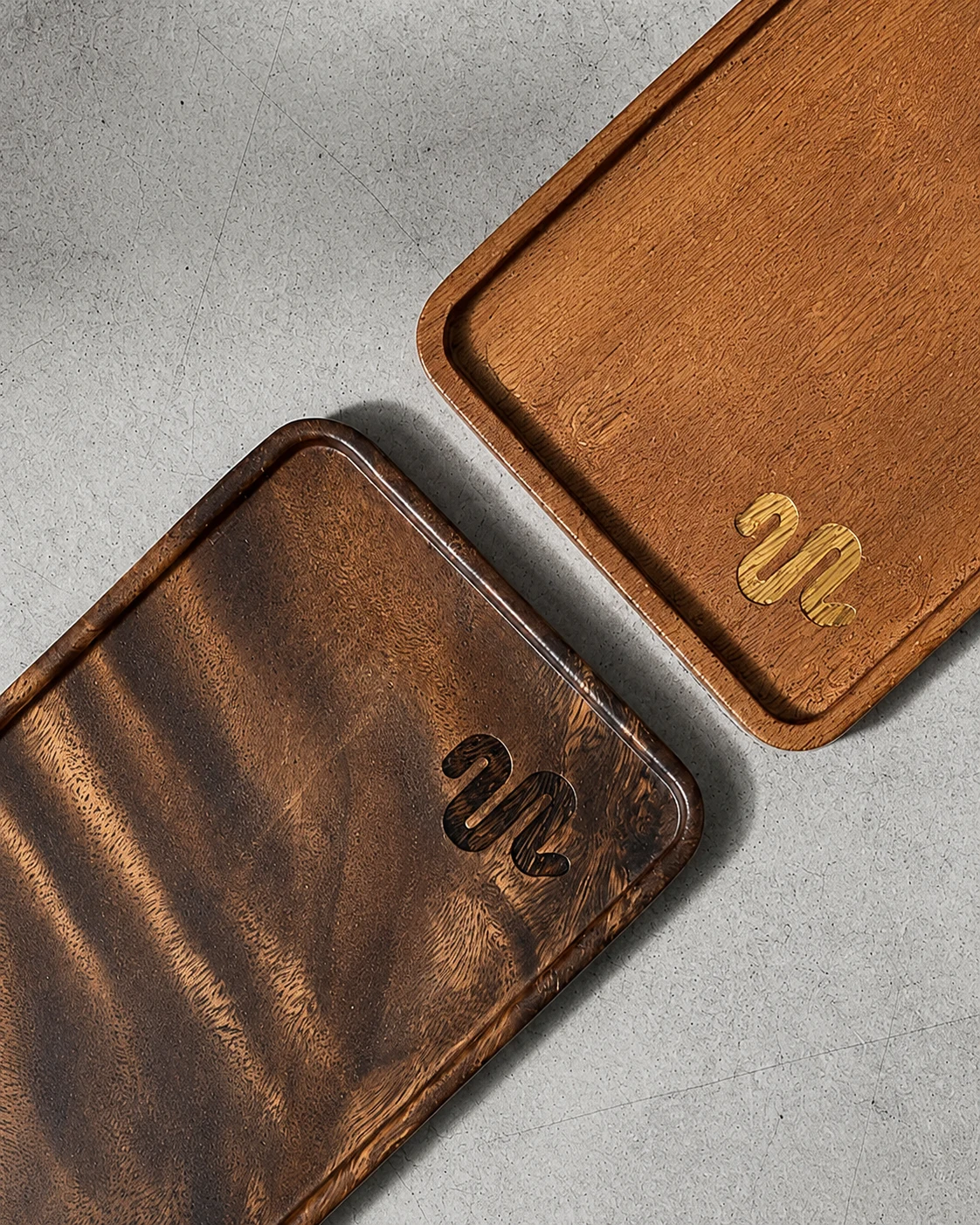
A complete brand identity system for a specialty coffee roaster — from the PCR combination mark to bean bags, cups, menus, tasting cards, stickers, laser-cut signage, and a full social media suite. Bold, minimal, and built for the serious coffee drinker.
Building a bold identity for serious specialty coffee
Peak Coffee Roasters needed a visual identity that matched their philosophy: every detail intentional, every process shaped with purpose. The brand had to communicate precision and craft — not just on a menu or a cup, but across a complete system from the logo mark to laser-cut wood signage. The challenge was building something bold enough to command attention while staying rooted in the discipline that defines specialty coffee.
Minimal system, maximum presence
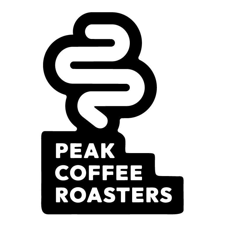
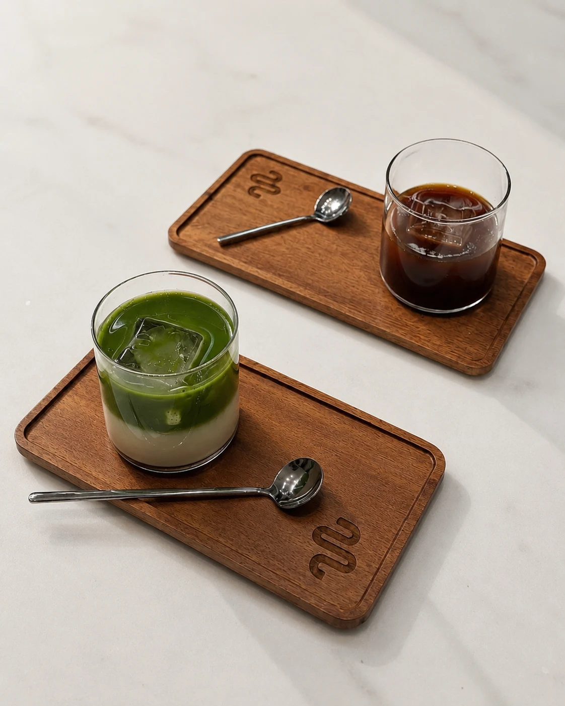
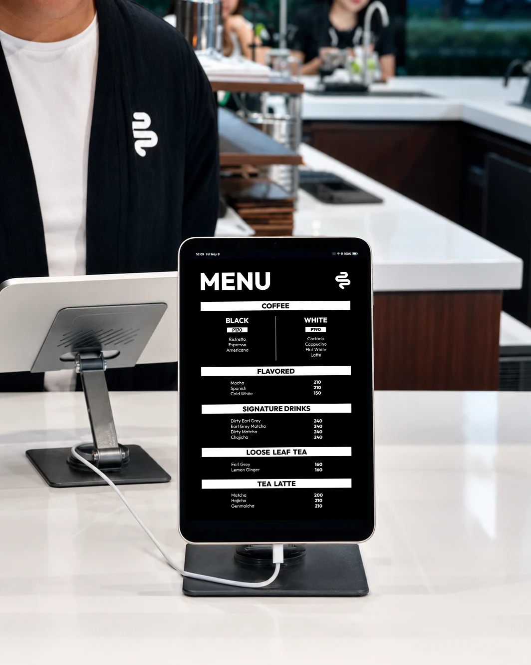
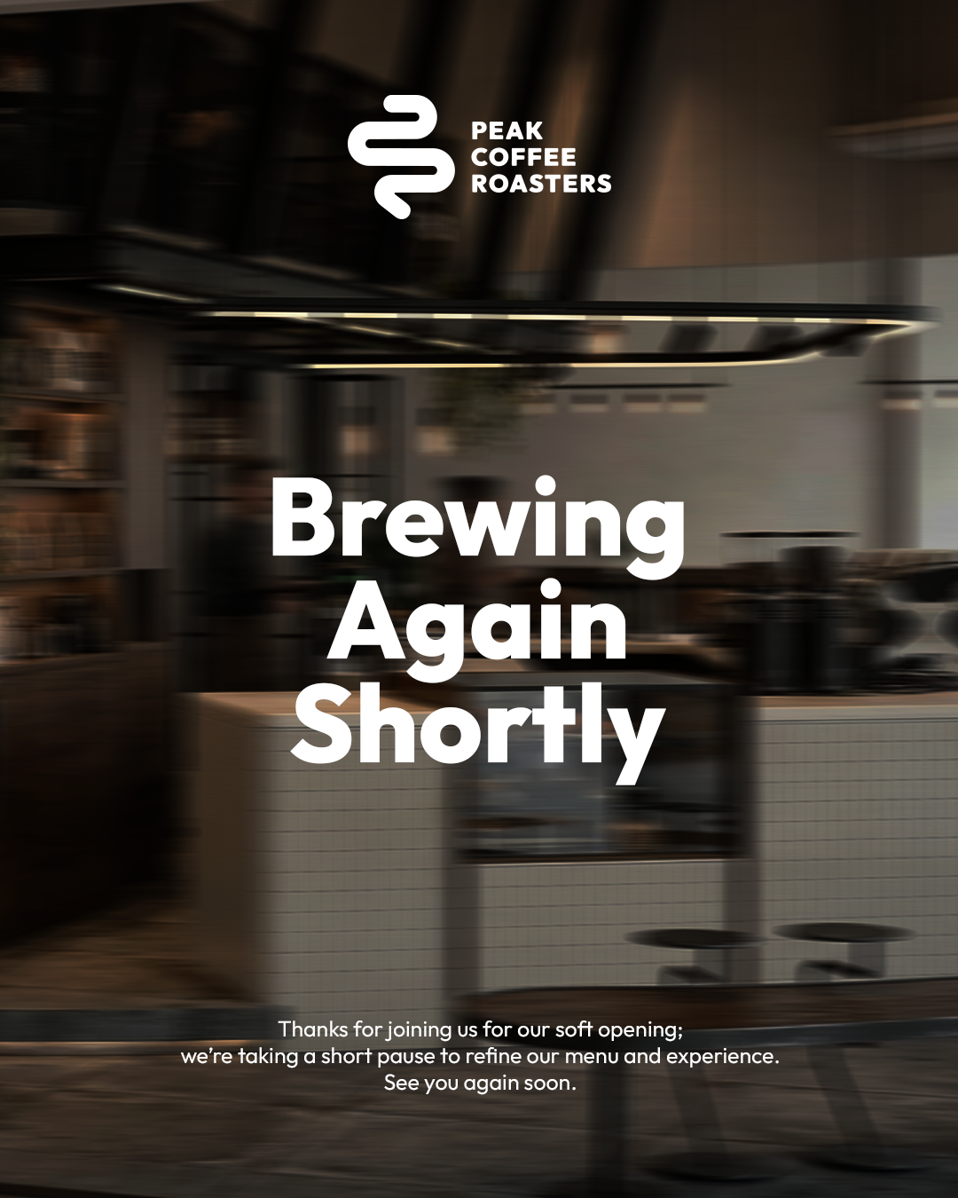
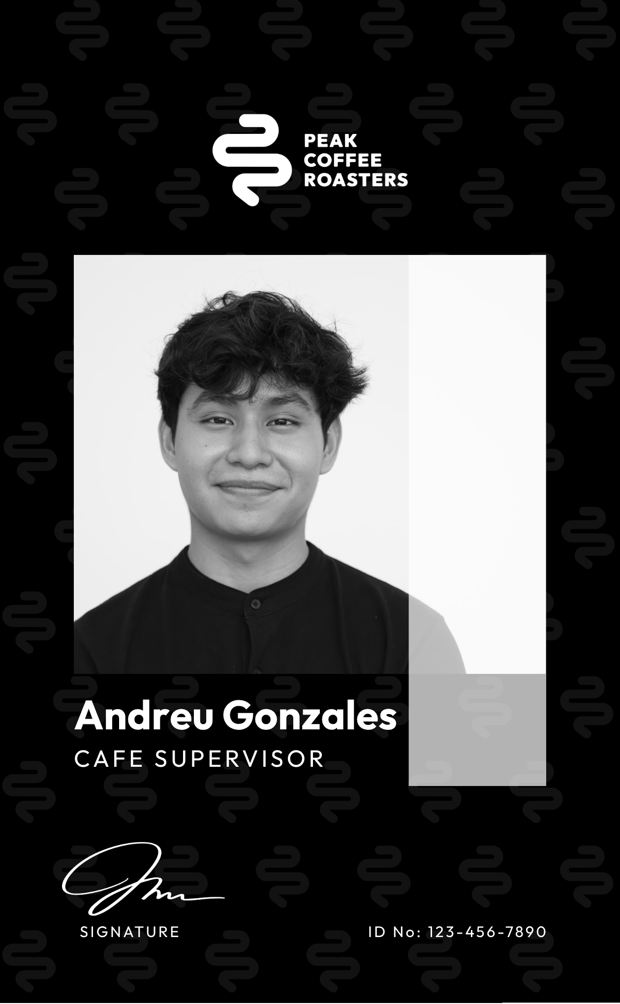
We developed the PCR combination mark — a geometric symbol built from the brand's initials P, C, and R, forming a path going upward. The identity is anchored in a primary palette of Black, Grey, and White, supported by secondary tones of Mahogany, Sky Blue, and Bean. Outfit was chosen as the sole typeface for its clean geometry and bold presence at any scale. From there we extended the system across every touchpoint: packaging, cups, menus, tasting cards, stickers, tissue paper, laser-cut signage, and a full social media template suite.
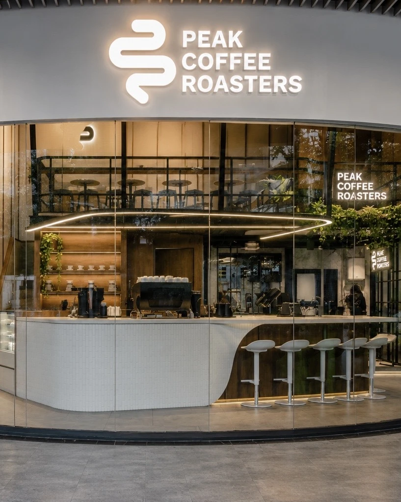
Logo & Mark
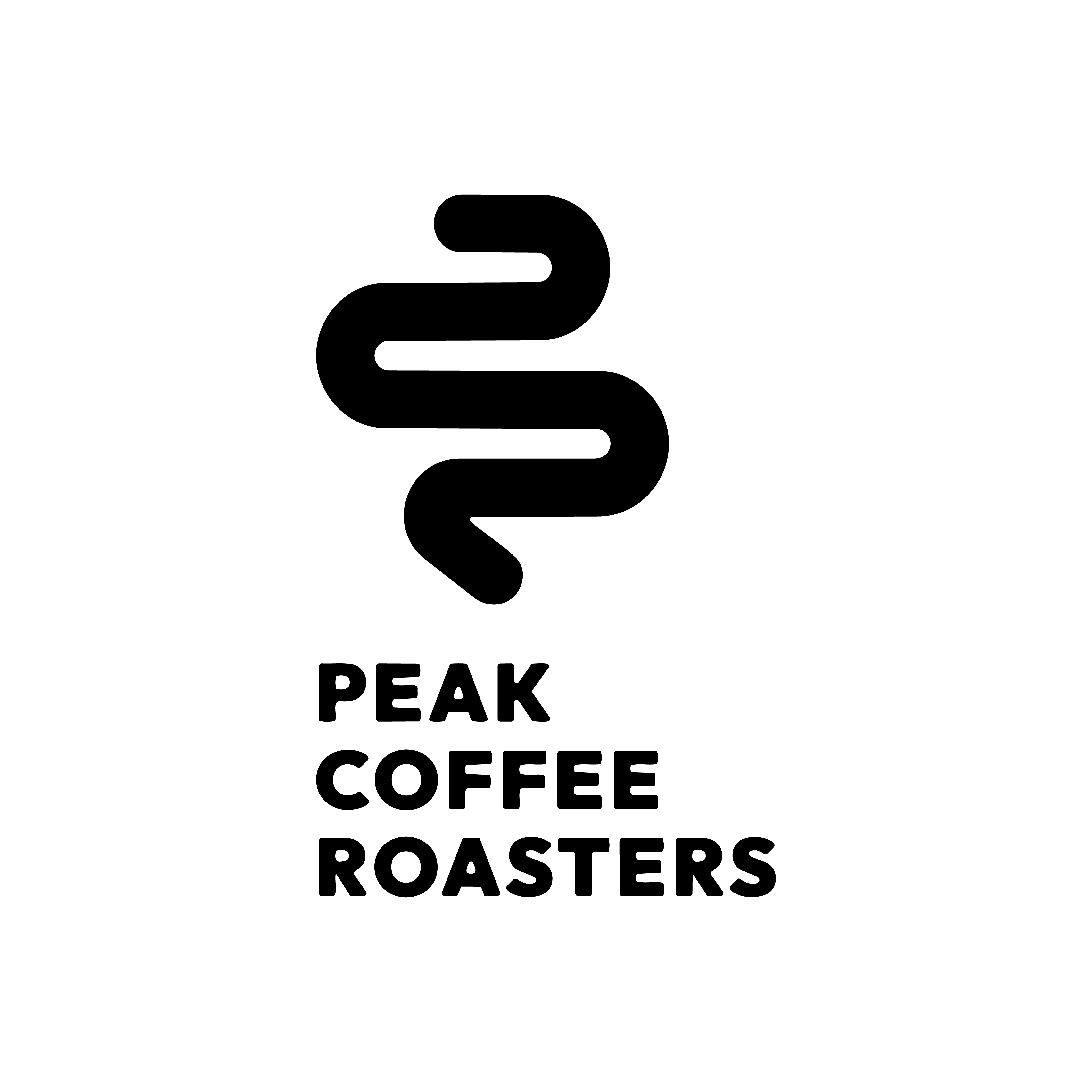
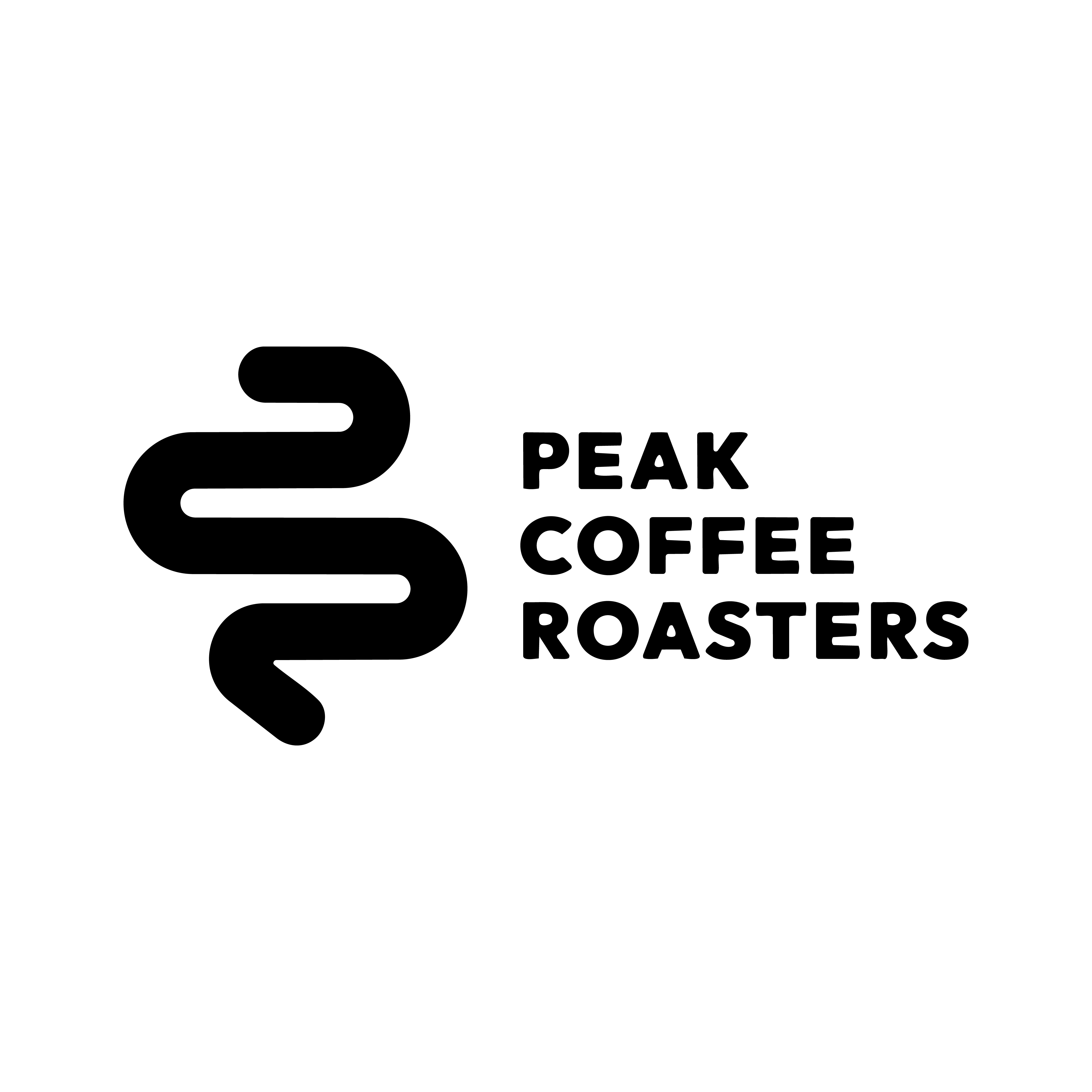
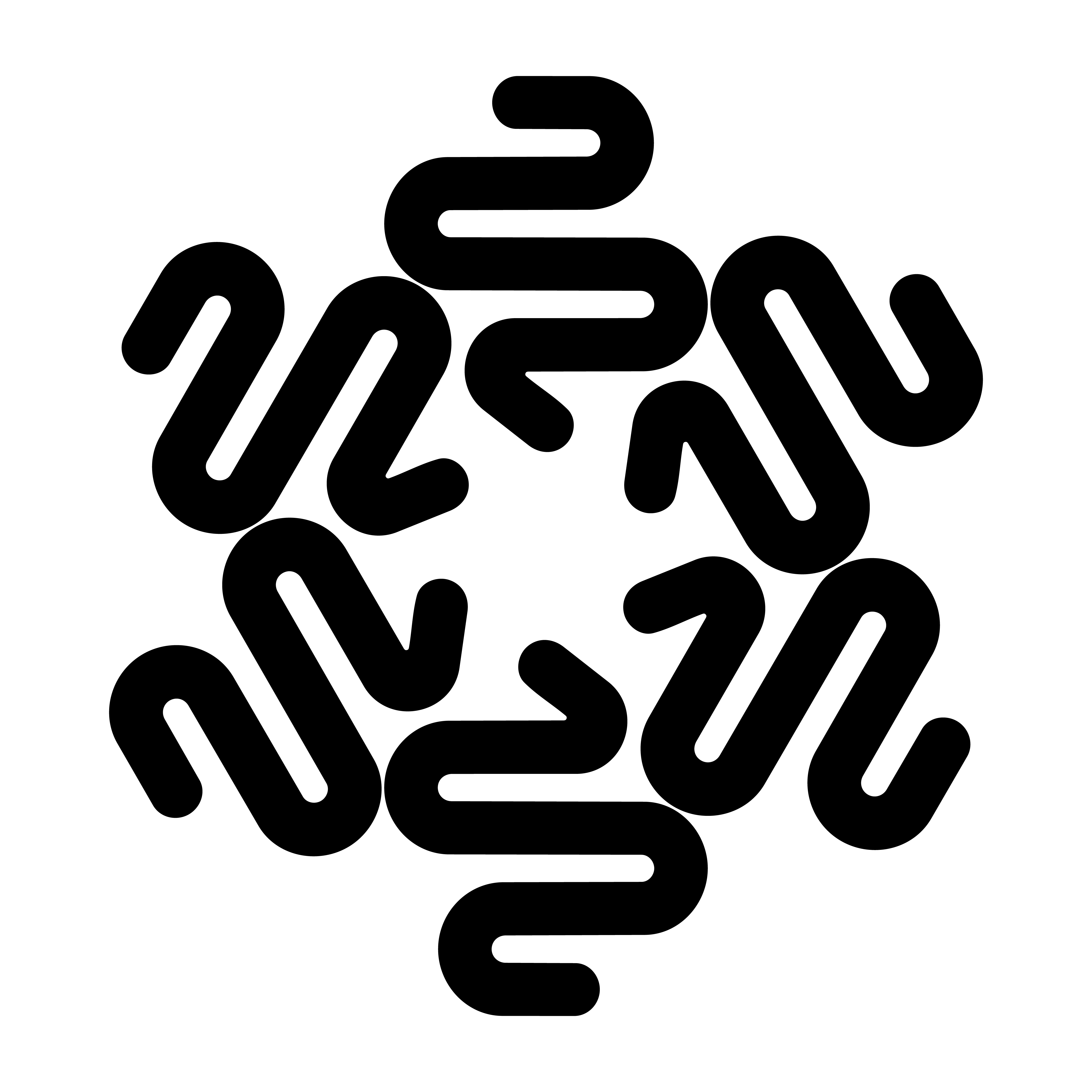
Type System
Outfit carries the entire brand — Extrabold for headlines and display, Regular for body copy and labels. Its geometric precision works across every scale, from large signage to fine label copy, keeping the brand consistent and unmistakable wherever it appears.
Brand Colors
Brand in Action
The Impact
Peak Coffee Roasters launched with a fully realized brand identity system — one that carries consistently from the first Instagram impression to the cup in hand, and every touchpoint in between.
Want something like this?
Let's build a brand that tells your story.
Get in touch and let's start creating.
Start a Project