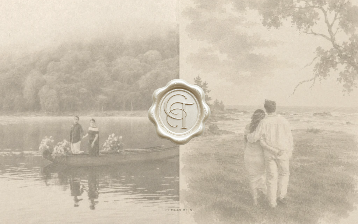
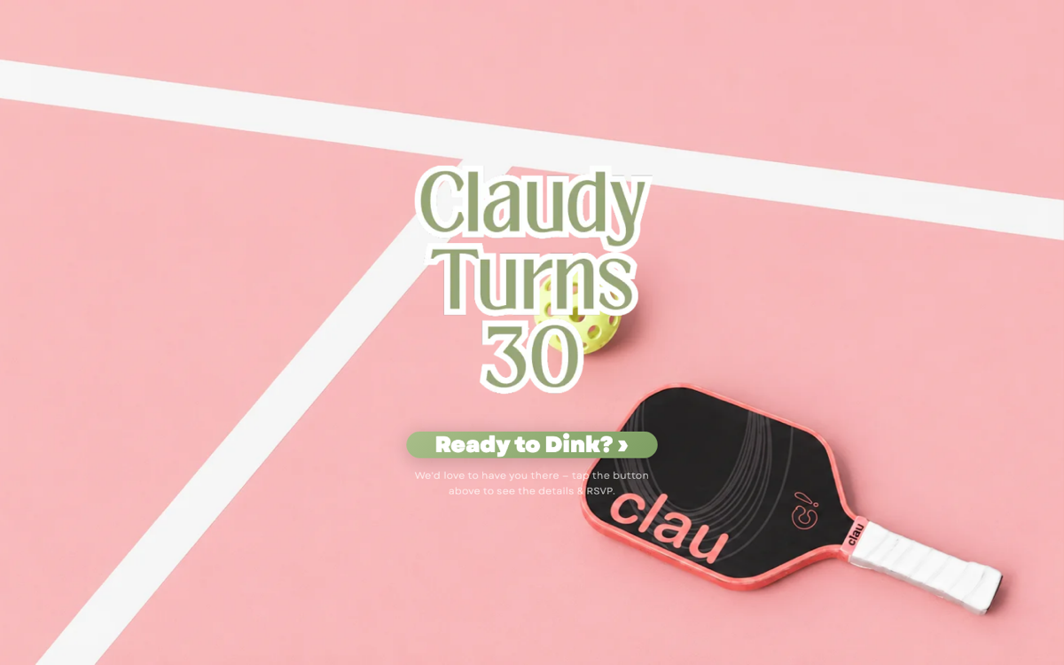
When Claudy came to us about her 30th, she did not ask for an elegant invitation. She asked for a pickleball one. That is a better brief than it sounds, and the result — claudyat30.com — taught us something we now bring to every event page we build.
Commit to the theme or drop it
The instinct with a themed invitation is to hedge. Add a small racket icon in the corner, keep the rest tasteful and neutral, call it a nod. That hedge produces the worst of both outcomes: it is no longer elegant, and it was never actually fun.
So we went the other way. The whole page is a pickleball court, shot from above, in a colour palette that has no business being subtle. A paddle with her name on it lies across the corner. The RSVP button does not say RSVP — it says Ready to Dink? A guest knows within half a second what kind of party this is and whether they are dressing for it.
“A theme that is only half-applied reads as a mistake. A theme that is fully applied reads as a decision.”
One page, one action
The other discipline here is restraint about function. There is one button. Not a navigation bar, not a schedule, not a gallery — one button, with a single line of copy underneath telling you what happens when you press it.
This is the same principle that governs a landing page for a business, and it is the one clients most often push back on. Every extra option you offer reduces the chance any single one gets taken. It is the same rule behind the business sites in our web design portfolio — an invitation is simply the purest version of it. There is exactly one thing you want a guest to do.
What we deliberately left off the page:
- A menu — there is nowhere else to go
- A countdown timer, which adds pressure without adding information
- A photo gallery, which belongs after the event and not before
- Anything requiring a guest to create an account or install an app
The theme has to survive the RSVP
Most themed invitations break at the form. The front is beautifully art-directed, then the RSVP throws you to a stock form in an unrelated typeface, and the illusion collapses at the exact moment you need the guest to act.
Carrying the design through the RSVP is unglamorous work and it is the part that matters. Same palette, same type, same voice in the confirmation message. The guest never leaves the world you built. It is the same argument for consistency we make about brands in our brand identity work, compressed into a single page.
Themes travel further than you expect
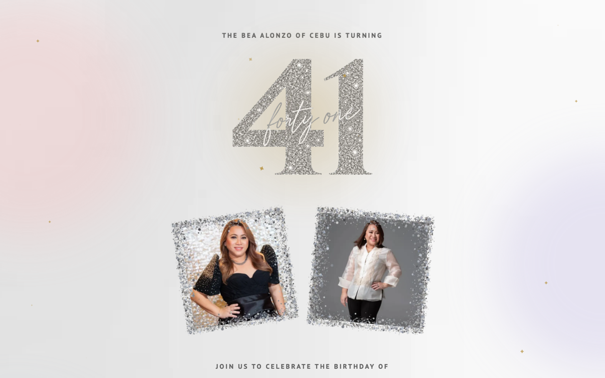
A strong theme is not limited to sport. We have built the same commitment into very different personalities — gelat30.com in hand-lettered script over pressed flowers, tercelat41.com in glitter-cut numerals built like a keepsake, and carloandtrixia.com as a wax-sealed envelope that opens.
None of them share a template. Each one starts from the person and works outward, which is exactly how we approach identity work generally — see brand strategy before design. The event is small, but the method is the same.
Anywhere in the Philippines
Because these are just websites, geography stops mattering. We are based in Cebu and have built invitations for events in Manila, Baguio and the provinces — the whole engagement happens over messages and calls. If you are planning something in Cebu specifically, we covered the local logistics in digital invitations in Cebu.
You can see more of these in our web design portfolio. When you are ready, tell us about your event — including the theme you assume is too silly to work. Those are usually the good ones.
Themes make the RSVP easier, not harder
A counterintuitive result: strongly themed invitations get faster responses. A generic invitation asks a guest to work out what kind of event this is, what to wear, and how seriously to take it. A themed one answers all three before the RSVP button, so the decision is simply yes or no.
That is the argument to make to a host who is nervous about committing. The theme is not decoration — it is doing the explaining that would otherwise happen over messages in the week before.
Where hosts get cold feet
The hesitation is almost always the same: will older relatives find this confusing. In practice, they do not — a single large button on a single page is easier to use than a Facebook event, and considerably easier than a form. The complexity people fear comes from navigation and choice, neither of which a good invitation has.
What genuinely does cause problems is weight. A page stuffed with high-resolution photography fails on a mid-range phone in a mall car park, and that failure is invisible to whoever approved it on a laptop. We treat page weight as a hard constraint for exactly that reason.
Topics
Explore Huna Creatives