
A movement studio sells two things at once. There is the feeling — a calm room, an unhurried hour, an instructor who knows your name — and there is the logistics — which class, what time, is there a spot, how do I pay. Most studios put the feeling on Instagram and the logistics in a third-party booking app that looks nothing like the brand.
Asana Ormoc wanted the two to be the same thing. What we built is the public site — home, class listing, class detail pages, instructor profiles, a schedule, and a trial-booking flow — plus a private hub where the studio manages classes, members, pricing and bookings without leaving its own system.
The site: quiet enough that the room does the talking
Wellness sites tend to over-signal calm — pale gradients, floaty animation, a lot of the word "journey". We went plainer than that. A warm, earthy palette, generous whitespace, photography given room to breathe, and type that stays out of the way. The studio's line, "Movement, with intention," sets the tone; the interface just holds it.
The homepage answers the three questions a first-time visitor actually has — what is this, who teaches it, and how do I try it — and then gets out of the way. Everything else is one tap from the nav.
“For a studio, the website is the first class. If it feels rushed or noisy, that is what people expect from the room.”
The schedule and class pages
Each class — mat work, yoga, the fluid and align formats, private and duo sessions — has its own page: what it is, who it suits, what to bring, and the instructors who run it. The schedule pulls from the same data the studio edits in the hub, so the times on the site are the times, not a screenshot someone forgot to update.
What the public site covers:
- A class library with a detail page per format and level
- Instructor profiles, linked from the classes they teach
- A live weekly schedule fed from the studio's own data
- A trial-booking flow for first-timers, including duo trials
- Pricing, location and contact, each a tap from anywhere

The hub: where the studio runs the day
Behind the site sits a private admin hub — the studio's own deployment of Sentro, shaped to how a class-based business works rather than a generic booking SaaS.
What it handles:
- The class catalogue, levels and descriptions the site renders
- The weekly schedule and any changes to it
- Members, pricing tiers and packages
- Bookings and trial requests, including duo trials, in one queue
- Instructor records and the FAQs shown on the site
The point of building it this way is that the person running the studio edits one thing and the public site reflects it. No plugin subscriptions stacking up, no export-and-reupload, no design drift between the booking widget and the brand.
Why a trial booking is its own flow
A returning member booking a regular class and a stranger booking their first trial are not the same job. The trial visitor needs a little more hand-holding — what to expect, what to wear, when to arrive — and the studio needs their details captured cleanly so the follow-up is easy. So the trial flow is deliberately separate from the standard schedule, with its own duo-trial variant for people who want to come with a friend.
One team, one system
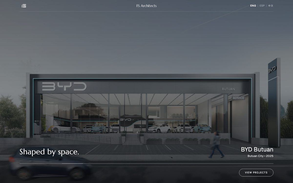
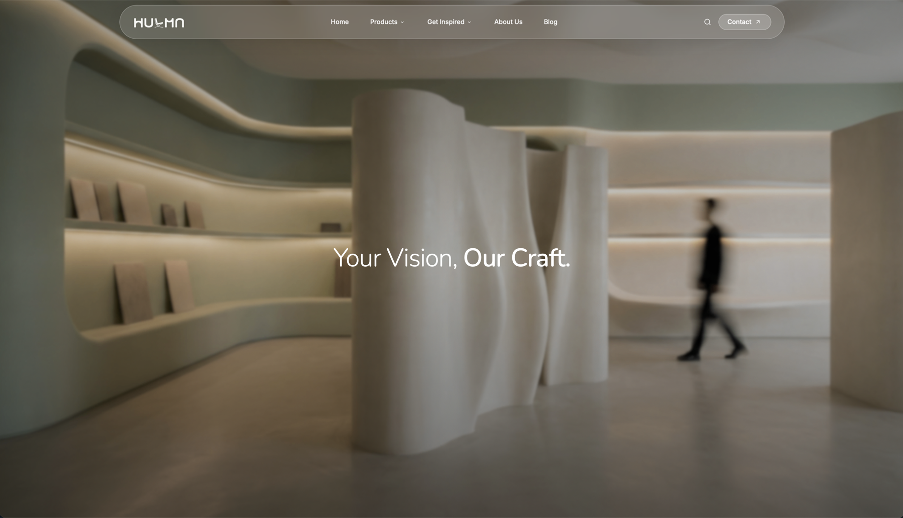
The usual version of this is two vendors — an agency for the site and a booking platform bolted on afterward. Running it as one build means the site and the hub share a codebase lineage and a visual language, and there is one team that owns the parts in between. You can see the site in our web design portfolio, alongside work like Hulma Cebu and FS Architects.
If you are running a studio on a template site and a booking app that fights your brand, the gap between them is doing more damage than it looks. Tell us how your studio runs.
Topics
Explore Huna Creatives